Tag Archives: tutorial

An Introduction to Structural Econometrics in Julia

By: Bradley Setzler

Re-posted from: http://juliaeconomics.com/2016/02/09/an-introduction-to-structural-econometrics-in-julia/

This tutorial is adapted from my Julia introductory lecture taught in the graduate course Practical Computing for Economists, Department of Economics, University of Chicago.

The tutorial is in 5 parts:

  1. Installing Julia + Juno IDE, as well as useful packages
  2. Defining a structural econometric challenge
  3. Data generation, management, and regression visualization
  4. Numerical simulation of optimal agent behavior under constraints
  5. Parallelized estimation by the Method of Simulated Moments

1. Installing Julia + Juno IDE, as well as useful packages

Perhaps the greatest obstacle to using Julia in the past has been the absence of an easy-to-install IDE. There used to be an IDE called Julia Studio which was as easy to use as the popular RStudio for R. Back then, you could install and run Julia + Julia Studio in 5mins, compared to the hours it could take to install Python and its basic packages and IDE. When Julia version 0.3.X was released, Julia Studio no longer worked, and I recommended the IJulia Notebook, which requires the installation of Python and IPython just to use Julia, so any argument that Julia is more convenient to install than Python was lost.

Now, with Julia version 0.4.X, Juno has provided an excellent IDE that comes pre-bundled with Julia for convenience, and you can install Julia + Juno IDE in 5mins. Here are some instructions to help you through the installation process:

  1. Go to http://julialang.org/downloads/ and look for “Julia + Juno IDE bundles“. Click to download the bundle for your system (Windows, Mac, or Linux).
  2. After the brief download (the entire Julia language + Juno IDE is less than 1GB), open the file and click through the installation instructions.
  3. Open Juno, and try to run a very simple line of code. For example, type 2+2, highlight this text, right-click, and choose the option Evaluate. A bubble should display 4 next to the line of code.
    • Trouble-shooting: On my Mac running OS X Mavericks, 2+2 failed and an unhelpful error was produced. After some searching, I found that the solution was to install the Jewel package. To install Jewel from within Juno, just type Pkg.add(“Jewel”), highlight this text, and Evaluate. After this, 2+2 was successful.
  4. You have successfully installed Julia + Juno IDE, which includes a number of important packages already, such as DataFrames, Gadfly, and Optim. Now, you will want to run the following codes to install some other packages used in the econometric exercises below:
Pkg.update()
Pkg.add("Ipopt")
Pkg.build("Ipopt")
Pkg.add("JuMP")
Pkg.build("JuMP")
Pkg.add("GLM")
Pkg.add("KernelEstimator")

2. Defining a structural econometric challenge

To motivate our application, we consider a very simple economic model, which I have taught previously in the mathematical economics course for undergraduates at the University of Chicago. Although the model is analytically simple, the econometrics become sufficiently complicated to warrant the Method of Simulated Moments, so this serves us well as a teachable case.

Let c_i \geq 0 denote consumption and 0 \leq l_i \leq 1 denote leisure. Consider an agent who wishes to maximize Cobb-Douglas utility over consumption and leisure, that is,

U(c_i,l_i) = c^\gamma_i l^{1-\gamma}_i .

where 0 \leq \gamma \leq 1 is the relative preference for consumption. The budget constraint is given by,

c_i \leq (1-\tau)w_i(1-l_i)+\epsilon_i,

where w_i is the wage observed in the data, \epsilon_i is other income that is not observed in the data, and \tau is the tax rate.

The agent’s problem is to maximize U(c_i,l_i) subject to the budget constraint. We assume that non-labor income is uncorrelated with the wage offer, so that \mathbb{E}[\epsilon_i | w_i]=0. Although this assumption is a bit unrealistic, as we expect high-wage agents to also tend to have higher non-labor income, it helps keep the example simple. The model is also a bit contrived in that we treat the tax rate as unobservable, but this only makes our job more difficult.

The goal of the econometrician is to identify the model parameters \gamma and \tau from the data (c_i,l_i,w_i)^N_{i=1} and the assumed structure. In particular, the econometrician is interested in the policy-relevant parameter \bar\psi \equiv \frac{1}{N}\sum^N_{i=1}\psi(w_i), where,

\psi(w_i) \equiv \mathbb{E}_{\epsilon} \frac{\partial}{\partial \tau} C(w_i,\epsilon; \gamma, \tau),

and C(\cdot) denotes the demand for consumption. \psi(w_i) is the marginal propensity for an agent with wage w_i to consume in response to the tax rate. \bar{\psi} is the population average marginal propensity to consume in response to the tax rate. Of course, we can solve the model analytically to find that \psi(w_i) = -\gamma w_i and \bar\psi = -\gamma \bar{w}, where \bar{w} is the average wage, but we will show that the numerical methods achieve the correct answer even when we cannot solve the model.


3. Data generation, management, and regression visualization

The replication code for this section is available here.

To generate data that follows the above model, we first solve analytically for the demand functions for consumption and leisure. In particular, they are,

C(w_i,\epsilon_i; \gamma, \tau) = \gamma (1-\tau) w_i + \gamma \epsilon_i

L(w_i,\epsilon_i; \gamma, \tau) = (1-\gamma) + \frac{(1-\gamma) \epsilon_i}{ (1-\tau) w_i}

Thus, we need only draw values of w_i and \epsilon_i, as well as choose parameter values for \gamma and \tau, in order to generate the values of c_i and l_i that agents in this model would choose. We implement this in Julia as follows:

####### Set Simulation Parameters #########
srand(123)           # set the seed to ensure reproducibility
N = 1000             # set number of agents in economy
gamma = .5           # set Cobb-Douglas relative preference for consumption
tau = .2             # set tax rate

####### Draw Income Data and Optimal Consumption and Leisure #########
epsilon = randn(N)                                               # draw unobserved non-labor income
wage = 10+randn(N)                                               # draw observed wage
consump = gamma*(1-tau)*wage + gamma*epsilon                     # Cobb-Douglas demand for c
leisure = (1.0-gamma) + ((1.0-gamma)*epsilon)./((1.0-tau)*wage)  # Cobb-Douglas demand for l

This code is relatively self-explanatory. Our parameter choices are N=1000, \epsilon_i \sim \mathcal{N}(0,1), \gamma=1/2, and \tau=1/5. We draw the wage to have distribution w_i \sim \mathcal{N}(10,1), but this is arbitrary.

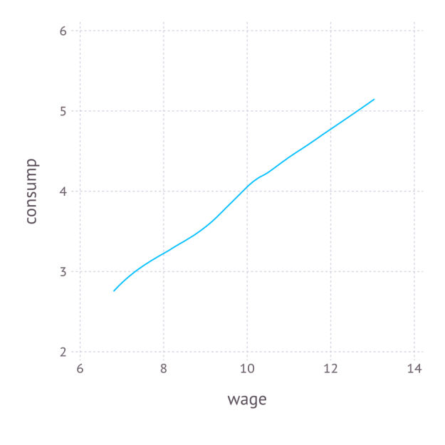
We combine the variables into a DataFrame, and export the data as a CSV file. In order to better understand the data, we also non-parametrically regress c_i on w_i, and plot the result with Gadfly. The Julia code is as follows:

####### Organize, Describe, and Export Data #########
using DataFrames
using Gadfly
df = DataFrame(consump=consump,leisure=leisure,wage=wage,epsilon=epsilon)  # create data frame
plot_c = plot(df,x=:wage,y=:consump,Geom.smooth(method=:loess))            # plot E[consump|wage] using Gadfly
draw(SVG("plot_c.svg", 4inch, 4inch), plot_c)                              # export plot as SVG
writetable("consump_leisure.csv",df)                                       # export data as CSV

Again, the code is self-explanatory. The regression graph produced by the plot function is:

plot_c


4. Numerical simulation of optimal agent behavior under constraints

The replication code for this section is available here.

We now use constrained numerical optimization to generate optimal consumption and leisure data without analytically solving for the demand function. We begin by importing the data and the necessary packages:

####### Prepare for Numerical Optimization #########

using DataFrames
using JuMP
using Ipopt
df = readtable("consump_leisure.csv")
N = size(df)[1]

Using the JuMP syntax for non-linear modeling, first we define an empty model associated with the Ipopt solver, and then add N values of c_i and N values of l_i to the model:

m = Model(solver=IpoptSolver())    # define empty model solved by Ipopt algorithm
@defVar(m, c[i=1:N] >= 0)       # define positive consumption for each agent
@defVar(m, 0 <= l[i=1:N] <= 1)  # define leisure in [0,1] for each agent 

This syntax is especially convenient, as it allows us to define vectors of parameters, each satisfying the natural inequality constraints. Next, we define the budget constraint, which also follows this convenient syntax:

 @addConstraint(m, c[i=1:N] .== (1.0-t)*(1.0-l[i]).*w[i] + e[i] )        # each agent must satisfy the budget constraint 

Finally, we define a scalar-valued objective function, which is the sum of each individual’s utility:

 @setNLObjective(m, Max, sum{ g*log(c[i]) + (1-g)*log(l[i]) , i=1:N } )  # maximize the sum of utility across all agents 

Notice that we can optimize one objective function instead of optimizing N objective functions because the individual constrained maximization problems are independent across individuals, so the maximum of the sum is the sum of the maxima. Finally, we can apply the solver to this model and extract optimal consumption and leisure as follows:

 status = solve(m)                                                       # run numerical optimization c_opt = getValue(c)                                                     # extract demand for c l_opt = getValue(l)                                                     # extract demand for l 

To make sure it worked, we compare the consumption extracted from this numerical approach to the consumption we generated previously using the true demand functions:

cor(c_opt,array(df[:consump]))
0.9999999998435865

Thus, we consumption values produced by the numerically optimizer’s approximation to the demand for consumption are almost identical to those produced by the true demand for consumption. Putting it all together, we create a function that can solve for optimal consumption and leisure given any particular values of \gamma, \tau, and \epsilon:

 function hh_constrained_opt(g,t,w,e)      m = Model(solver=IpoptSolver())                                         # define empty model solved by Ipopt algorithm
  @defVar(m, c[i=1:N] >= 0)                                               # define positive consumption for each agent
  @defVar(m, 0 <= l[i=1:N] <= 1)                                          # define leisure in [0,1] for each agent
  @addConstraint(m, c[i=1:N] .== (1.0-t)*(1.0-l[i]).*w[i] + e[i] )        # each agent must satisfy the budget constraint
  @setNLObjective(m, Max, sum{ g*log(c[i]) + (1-g)*log(l[i]) , i=1:N } )  # maximize the sum of utility across all agents
  status = solve(m)                                                       # run numerical optimization
  c_opt = getValue(c)                                                     # extract demand for c
  l_opt = getValue(l)                                                     # extract demand for l
  demand = DataFrame(c_opt=c_opt,l_opt=l_opt)                             # return demand as DataFrame
end

hh_constrained_opt(gamma,tau,array(df[:wage]),array(df[:epsilon]))          # verify that it works at the true values of gamma, tau, and epsilon

5. Parallelized estimation by the Method of Simulated Moments

The replication codes for this section are available here.

We saw in the previous section that, for a given set of model parameters \gamma and \tau and a given draw of \epsilon_{i} for each i, we have enough information to simulation c_{i} and l_{i}, for each i. Denote these simulated values by \hat{c}_{i}\left(\epsilon;\gamma,\tau\right) and \hat{l}_{i}\left(\epsilon;\gamma,\tau\right). With these, we can define the moments,

\hat{m}\left(\gamma,\tau\right)=\mathbb{E}_{\epsilon}\left[\begin{array}{c} \frac{1}{N}\sum_{i}\left[\hat{c}_{i}\left(\epsilon\right)-c_{i}\right]\\ \frac{1}{N}\sum_{i}\left[\hat{l}_{i}\left(\epsilon\right)-l_{i}\right] \end{array}\right]

which is equal to zero under the model assumptions. A method of simulated moments (MSM) approach to estimate \gamma and \tau is then,

\left(\hat{\gamma},\hat{\tau}\right)=\arg\min_{\gamma\in\left[0,1\right],\tau\in\left[0,1\right]}\hat{m}\left(\gamma,\tau\right)'W\hat{m}\left(\gamma,\tau\right)

where W is a 2\times2 weighting matrix, which is only relevant when the number of moments is greater than the number of parameters, which is not true in our case, so W can be ignored and the method of simulated moments simplifies to,

\left(\hat{\gamma},\hat{\tau}\right)=\arg\min_{\gamma\in\left[0,1\right],\tau\in\left[0,1\right]}\left\{ \mathbb{E}_{\epsilon}\left[\frac{1}{N}\sum_{i}\left[\hat{c}_{i}\left(\epsilon\right)-c_{i}\right]\right]\right\} ^{2}+\left\{ \mathbb{E}_{\epsilon}\left[\frac{1}{N}\sum_{i}\left[\hat{l}_{i}\left(\epsilon\right)-l_{i}\right]\right]\right\} ^{2}

Assuming we know the distribution of \epsilon_i, we can simply draw many values of \epsilon_i for each i, and average the moments together across all of the draws of \epsilon_i. This is Monte Carlo numerical integration. In Julia, we can create this objective function with a random draw of \epsilon as follows:

function sim_moments(params)
  this_epsilon = randn(N)                                                     # draw random epsilon
  ggamma,ttau = params                                                        # extract gamma and tau from vector
  this_demand = hh_constrained_opt(ggamma,ttau,array(df[:wage]),this_epsilon) # obtain demand for c and l
  c_moment = mean( this_demand[:c_opt] ) - mean( df[:consump] )               # compute empirical moment for c
  l_moment = mean( this_demand[:l_opt] ) - mean( df[:leisure] )               # compute empirical moment for l
  [c_moment,l_moment]                                                         # return vector of moments
end

In order to estimate \hat{m}\left(\gamma,\tau\right), we need to run sim_moments(params) many times and take the unweighted average across them to achieve the expectation across \epsilon_i. Because each calculation is computer-intensive, it makes sense to compute the contribution of \hat{m}\left(\gamma,\tau\right) for each draw of \epsilon_i on a different processor and then average across them.

Previously, I presented a convenient approach for parallelization in Julia. The idea is to initialize processors with the addprocs() function in an “outer” script, then import all of the needed data and functions to all of the different processors with the require() function applied to an “inner” script, where the needed data and functions are already managed by the inner script. This is incredibly easy and much simpler than the manual spawn-and-fetch approaches suggested by Julia’s official documentation.

In order to implement the parallelized method of simulated moments, the function hh_constrained_opt() and sim_moments() are stored in a file called est_msm_inner.jl. The following code defines the parallelized MSM and then minimizes the MSM objective using the optimize command set to use the Nelder-Mead algorithm from the Optim package:

####### Prepare for Parallelization #########

addprocs(3)                   # Adds 3 processors in parallel (the first is added by default)
print(nprocs())               # Now there are 4 active processors
require("est_msm_inner.jl")   # This distributes functions and data to all active processors

####### Define Sum of Squared Residuals in Parallel #########

function parallel_moments(params)
  params = exp(params)./(1.0+exp(params))   # rescale parameters to be in [0,1]
  results = @parallel (hcat) for i=1:numReps
    sim_moments(params)
  end
  avg_c_moment = mean(results[1,:])
  avg_l_moment = mean(results[2,:])
  SSR = avg_c_moment^2 + avg_l_moment^2
end

####### Minimize Sum of Squared Residuals in Parallel #########

using Optim
function MSM()
  out = optimize(parallel_moments,[0.,0.],method=:nelder_mead,ftol=1e-8)
  println(out)                                       # verify convergence
  exp(out.minimum)./(1.0+exp(out.minimum))           # return results in rescaled units
end

Parallelization is performed by the @parallel macro, and the results are horizontally concatenated from the various processors by the hcat command. The key tuning parameter here is numReps, which is the number of draws of \epsilon to use in the Monte Carlo numerical integration. Because this example is so simple, a small number of repetitions is sufficient, while a larger number would be needed if \epsilon entered the model in a more complicated manner. The process is run as follows and requires 268 seconds to run on my Macbook Air:

numReps = 12                                         # set number of times to simulate epsilon
gamma_MSM, tau_MSM = MSM()                           # Perform MSM
gamma_MSM
0.49994494921381816
tau_MSM
0.19992279518894465

Finally, given the MSM estimates of \gamma and \tau, we define the numerical derivative, \frac{df(x)}{dx} \approx \frac{f(x+h)-f(x-h)}{2h}, for some small h, as follows:

function Dconsump_Dtau(g,t,h)
  opt_plus_h = hh_constrained_opt(g,t+h,array(df[:wage]),array(df[:epsilon]))
  opt_minus_h = hh_constrained_opt(g,t-h,array(df[:wage]),array(df[:epsilon]))
  (mean(opt_plus_h[:c_opt]) - mean(opt_minus_h[:c_opt]))/(2*h)
end

barpsi_MSM = Dconsump_Dtau(gamma_MSM,tau_MSM,.1)
-5.016610457903023

Thus, we estimate the policy parameter \bar\psi to be approximately -5.017 on average, while the true value is \bar\psi = -\gamma \bar{w} = -(1/2)\times 10=-5, so the econometrician’s problem is successfully solved.


Bradley Setzler


Using ASCIIPlots.jl

No Julia plotting package has been crowned king yet. Winston and Gadfly are the main competitors. PyPlot is a Julia wrapper around Python’s matplotlib; it is a stop-gap for use while the native Julia implementations mature. However, all three of these packages have non-Julia dependencies; this can cause installation frustration. An alternative is ASCIIPlots; it’s the simplest plotting package to install, due to having no dependencies. To be fair, ASCIIPlots is also a tiny package with only basic functionality.

The small size of the package makes it a great target for Julia users looking to make their first contributions to the ecosystem. There are four source files totaling about 250 lines of code; the entire premise is taking in Arrays of numbers and printing out characters. The small size and lack of conceptual complexity make it an approachable package, even for less experienced Julians. I’ll mention new feature ideas throughout this post, in the hopes that some of you will submit pull requests.

Compared to the standard approach of using images, plotting using ASCII characters has some draw backs, namely: low-resolution (256 pixels per 12pt character) and few options (2^8 to 2^24 colors vs 95 printable ASCII characters). Currently, ASCIIPlots only uses ASCII characters and does not support color, even if your terminal does support colors. Adding coloring to any of the plot types would be neat; you could use terminal escape sequences to change the styling.

You can install ASCIIPlots with Pkg.add("ASCIIPlots") at the Julia REPL. This command will clone the repo from github into your ~/.julia/v0.X directory, where all installed Julia packages are stored. When you want to start using ASCIIPlots, you’ll need to run using ASCIIPlots to get access to the package’s functions.

ASCIIPlots exports three functions: scatterplot, lineplot, and imagesc. The first two functions have fairly clear names; the last is a “heatmap” function, with a funny name because Matlab.

Scatter Plots

Of all the ASCIIPlot functions, scatterplot seems to take the least damage from the constraints of ASCII art. The points appear well placed, and it has some logic to handle too many points for it’s resolution.

scatterplot is happy to accept one or two Vectors (1 dimensional Arrays). If one vector is provided, then its values are the y-values and their indices are the x-values. If two vectors are passed in, then the first will contain the x-values and the second will contain the y-values.

Plotting a Vector

As a first example, let’s plot the integers 10 through 20. This is allows us to differentiate the values from the indices.

scatterplot([10:20])

Result:

    -------------------------------------------------------------
    |                                                           ^| 20.00
    |                                                            |
    |                                                     ^      |
    |                                                            |
    |                                               ^            |
    |                                                            |
    |                                         ^                  |
    |                                                            |
    |                                   ^                        |
    |                                                            |
    |                             ^                              |
    |                                                            |
    |                       ^                                    |
    |                                                            |
    |                 ^                                          |
    |                                                            |
    |           ^                                                |
    |                                                            |
    |     ^                                                      |
    |^                                                           | 10.00
    -------------------------------------------------------------
    1.00                                                    11.00

The placement of the points looks pretty good; forming a line is a good sign. We can see the indices are on the horizontal axis, since its range is 1 to 11; the vertical axis has a range of 10 to 20, corresponding to our values.

We can also mix up the values, to see how noisier data looks. I’ll sneak an additional option into this example.

scatterplot(shuffle!([10:20]);sym='*')

sym is an optional named argument; it takes an ASCII character to use for the plotted points. As we saw above, the default is ^.

Result:

    -------------------------------------------------------------
    |*                                                           | 20.00
    |                                                            |
    |                                   *                        |
    |                                                            |
    |     *                                                      |
    |                                                            |
    |                                                     *      |
    |                                                            |
    |                       *                                    |
    |                                                            |
    |                                         *                  |
    |                                                            |
    |                 *                                          |
    |                                                            |
    |                                                           *|
    |                                                            |
    |                             *                              |
    |                                                            |
    |                                               *            |
    |           *                                                | 10.00
    -------------------------------------------------------------
    1.00                                                    11.00

I had been hoping to use unicode snowman to plot those points. Alas, ASCIIPlots is true to its name and only uses ASCII characters. Maybe one of you could fix this and add some unicode support? Plotting with and is pretty important.

Plotting Two Vectors

If we pass in two Vectors, then the first will be the horizontal coordinates and the second will be the vertical coordinates. The Array indices will not be used, other than to match up the two coordinates for each point. We can use two non-overlapping ranges for our Vectors to see which Vector is on which axis.

scatterplot([10:20],[31:41])

Result:

    -------------------------------------------------------------
    |                                                           ^| 41.00
    |                                                            |
    |                                                     ^      |
    |                                                            |
    |                                               ^            |
    |                                                            |
    |                                         ^                  |
    |                                                            |
    |                                   ^                        |
    |                                                            |
    |                             ^                              |
    |                                                            |
    |                       ^                                    |
    |                                                            |
    |                 ^                                          |
    |                                                            |
    |           ^                                                |
    |                                                            |
    |     ^                                                      |
    |^                                                           | 31.00
    -------------------------------------------------------------
    10.00                                                    20.00

It’s not clear to me whether this is the right API. Since Julia has multidimensional Arrays, taking an Array{T,2}, with a column of x-values and a column of y-values would make at least as much sense as two vectors. Alternately, the two vector version could take a vector of tuples. API desig isn’t something I have much experience at, so I’m open to other opinions. In a well-designed API, the signature and name of a function provide a clear idea of how to use it; I’m not sure how to achieve that here.

Plotting Real Data

While plugging in random data is fine for seeing how the interface works, it doesn’t show how well ASCIIPlots might work for real data.
The RDatasets repo on github has a bunch of small, simple, clean datasets; I’ll be using Monthly Airline Passenger Numbers 1949-1960 here.

The first step is to get the data out of the file and into a reasonable format.

file = open("AirPassengers.csv")
raw_data = readcsv(file)
close(file)

raw_data is an Array{Any,2}. It has three columns: index, time, and passengers. The time format is in fractional years: January of 1950 is 1950.0, February is 1950.08, April is 1950.25, and so on.
The first row is header strings.

raw_data
145x3 Array{Any,2}:
 """"         ""time""     ""AirPassengers""
 ""1""    1949.0          112.0                 
 ""2""    1949.08         118.0                 
 ""3""    1949.17         132.0                 
 ""4""    1949.25         129.0                 
 ""5""    1949.33         121.0                 
 ""6""    1949.42         135.0                 
                                                 
 ""138""  1960.42         535.0                 
 ""139""  1960.5          622.0                 
 ""140""  1960.58         606.0                 
 ""141""  1960.67         508.0                 
 ""142""  1960.75         461.0                 
 ""143""  1960.83         390.0                 
 ""144""  1960.92         432.0 

The floating-point representation of a year-month is actually very convenient for us; these will plot in order without any work on our part. We want to get the second column as Float64s, without the first row.

The passenger counts are also written with a decimal point, but are (unsurprisingly) all integers. To get a Vector of these counts, we need the third column as Ints, again without the first row.

months = float(raw_data[2:end,2])
passengers = int(raw_data[2:end,3])

Now that we have two numeric Vectors, I’m ready to plot. The months will be the horizontal values and the passenger counts will be the vertical ones.

scatterplot(months,passengers)

Result:

    -------------------------------------------------------------
    |                                                        ^   | 622.00
    |                                                         ^  |
    |                                                            |
    |                                                   ^^       |
    |                                                        ^   |
    |                                               ^         ^  |
    |                                          ^        ^^  ^^ ^ |
    |                                              ^            ^|
    |                                     ^   ^^    ^  ^^ ^^^    |
    |                                                  ^   ^   ^ |
    |                                ^   ^^  ^^   ^^ ^^   ^      |
    |                                ^       ^  ^^^   ^          |
    |                           ^   ^ ^ ^^ ^^^  ^^   ^           |
    |                      ^    ^  ^^ ^^^  ^                     |
    |                 ^   ^^   ^ ^^^                             |
    |                ^^  ^^ ^ ^^ ^^^  ^                          |
    |            ^  ^  ^^^  ^^^  ^                               |
    |       ^  ^^ ^^^^ ^    ^                                    |
    |^ ^^ ^^^^^^   ^                                             |
    |^^ ^^^^  ^                                                  | 104.00
    -------------------------------------------------------------
    1949.00                                                    1960.92

That plot looks pretty reasonable. Due to the poor display resolution, there are multiple values plotted in some columns, despite there being only one y-axis data value per x-axis month. We can see that the data seems a bit noisy and increases over time. My hypothesis is that the noisy is due in large part to seasonal variations in passenger counts.

To test this, let’s zoom in on a couple of years to see what they look like:

1949: scatterplot(months[1:12],passengers[1:12])

    -------------------------------------------------------------
    |                                ^    ^                      | 148.00
    |                                                            |
    |                                                            |
    |                                                            |
    |                                                            |
    |                                                            |
    |                          ^               ^                 |
    |          ^                                                 |
    |                                                            |
    |                ^                                           |
    |                                                            |
    |                                                            |
    |                     ^                                      |
    |     ^                                          ^          ^|
    |                                                            |
    |                                                            |
    |^                                                           |
    |                                                            |
    |                                                            |
    |                                                     ^      | 104.00
    -------------------------------------------------------------
    1949.00                                                    1949.92

The first year, 1949, has a spike in the spring (around March) and a bigger one in the summer (peaking in July and August).

1950: scatterplot(months[13:24],passengers[13:24])

    -------------------------------------------------------------
    |                                ^    ^                      | 170.00
    |                                                            |
    |                                                            |
    |                                                            |
    |                                                            |
    |                                          ^                 |
    |                                                            |
    |                                                            |
    |                          ^                                 |
    |                                                            |
    |          ^                                                 |
    |                                                           ^|
    |                ^                                           |
    |                                                ^           |
    |                                                            |
    |     ^                                                      |
    |                     ^                                      |
    |                                                            |
    |                                                            |
    |^                                                    ^      | 114.00
    -------------------------------------------------------------
    1950.00                                                    1950.92

The second year has about the same spikes (March and July/August).

1959: scatterplot(months[end-23:end-12],passengers[end-23:end-12])

    -------------------------------------------------------------
    |                                     ^                      | 559.00
    |                                ^                           |
    |                                                            |
    |                                                            |
    |                                                            |
    |                                                            |
    |                                                            |
    |                                                            |
    |                          ^                                 |
    |                                          ^                 |
    |                                                            |
    |                                                            |
    |                                                            |
    |                     ^                                      |
    |          ^                                     ^          ^|
    |                ^                                           |
    |                                                            |
    |                                                            |
    |^                                                    ^      |
    |     ^                                                      | 342.00
    -------------------------------------------------------------
    1959.00                                                    1959.92

In the second to last year, the March spike is much smaller, but still there; July and August are still the peak travel months.

1960: scatterplot(months[end-11:end],passengers[end-11:end])

    -------------------------------------------------------------
    |                                ^                           | 622.00
    |                                                            |
    |                                     ^                      |
    |                                                            |
    |                                                            |
    |                                                            |
    |                                                            |
    |                                                            |
    |                          ^                                 |
    |                                                            |
    |                                          ^                 |
    |                                                            |
    |                                                            |
    |                     ^                                      |
    |                ^                               ^           |
    |                                                            |
    |                                                           ^|
    |^         ^                                                 |
    |                                                            |
    |     ^                                               ^      | 390.00
    -------------------------------------------------------------
    1960.00                                                    1960.92

The final year seems to lack the March spike, but still has the overall peak in July/August.

These seasonal variations probably contribute a lot to the spread of the numbers in the 1949-1960 chart. The lowest month for each of these four years has about two-thirds the number of passengers for the highest month. As the number of passengers per year increases, so does the spread, despite still being one-third of the peak.

Line Plots

The interface for lineplot is identical to scatterplot — one or two Vectors, which control the axises in the same way as above. The difference is in the characters used to plot the points. When ASCIIPlots tries to draw a line, it picks /s, s, and -s in order to show the slope of the line at each point.

Plotting a Vector

First, I’ll plot a line. With the name lineplot, you might have some high expectations of the output here.

lineplot([11:20])

Result:

    -------------------------------------------------------------
    |                                                           /| 20.00
    |                                                            |
    |                                                            |
    |                                                    /       |
    |                                                            |
    |                                             /              |
    |                                                            |
    |                                       /                    |
    |                                                            |
    |                                /                           |
    |                                                            |
    |                          /                                 |
    |                                                            |
    |                   /                                        |
    |                                                            |
    |             /                                              |
    |                                                            |
    |      /                                                     |
    |                                                            |
    |/                                                           | 11.00
    -------------------------------------------------------------
    1.00                                                    10.00

It’s not terrible; you can see the linear-ness and easily play connect-the-dots with the slashes.

We can make things a lot harder for lineplot by shuffling the data around, so that it’s not linear.

lineplot(shuffle!([11:20]))

Result:

    -------------------------------------------------------------
    |                                                           | 20.00
    |                                                            |
    |                                                            |
    |                                                           |
    |                                                            |
    |                                                           |
    |                                                            |
    |                   /                                        |
    |                                                            |
    |                                                           |
    |                                                            |
    |                                                           |
    |                                                            |
    |                                                           |
    |                                                            |
    |      /                                                     |
    |                                                            |
    |                                                           |
    |                                                            |
    |                                             /              | 11.00
    -------------------------------------------------------------
    1.00                                                    10.00

lineplot‘s output is not as good as I would like here; I find it much harder to connect-the-slashes. Part of the problem is the number of points I gave it versus the resolution it’s using. Despite the fact that more columns of characters fit between my data points, lineplot does not fill in more slashes. This is more useful here, where there’s a large vertical gap between points, that it would be for the previous example.

Plotting Two Vectors

We can see in this example that putting more slashes in makes the lines look better.

lineplot([2:20],[32:50])
    -------------------------------------------------------------
    |                                                           /| 50.00
    |                                                            |
    |                                                       /    |
    |                                                    /       |
    |                                                 /          |
    |                                             /              |
    |                                          /                 |
    |                                       /                    |
    |                                    /                       |
    |                                /                           |
    |                             /                              |
    |                          /                                 |
    |                      /                                     |
    |                   /                                        |
    |                /                                           |
    |             /                                              |
    |         /                                                  |
    |      /                                                     |
    |   /                                                        |
    |/                                                           | 32.00
    -------------------------------------------------------------
    2.00                                                    20.00

More data points is less helpful in a shuffled data set, because is also makes the line a lot more wiggly. lineplot does better the less wiggly the line is, and the more points your provide for it.

lineplot(shuffle!([2:20]),[32:50])
    -------------------------------------------------------------
    |                                                           | 70.00
    |                                                          |
    |                                                          |
    |                                                          |
    |                                                          /|
    |                                                          |
    |                              /                            |
    |                                                          |
    |      /                                                    |
    |                             /        /                     |
    |                                                          |
    |                    /                           /           |
    |          /                                              /  |
    |                                 /                         |
    |         /                                                 |
    |    /                                /                      |
    |                 /                                         |
    |                                             /     /        |
    |               /                                       /    |
    | /                      /                                   | 32.00
    -------------------------------------------------------------
    2.00                                                    40.00

Ploting Real Data

So far we’ve just been drawing lines. I’ve pulled another dataset out of RDatasets: this time, it’s Averge Yearly Temperature in New Haven.

First, we need to read in the file.

file = open("nhtemp.csv")
rawdata = readcsv(file)
close(file)

This CSV has three columns: index, year, temperature.

raw_data
61x3 Array{Any,2}:
 """"        ""time""    ""nhtemp""
 ""1""   1912.0          49.9          
 ""2""   1913.0          52.3          
 ""3""   1914.0          49.4          
 ""4""   1915.0          51.1          
 ""5""   1916.0          49.4          
                                                 
 ""56""  1967.0          50.8          
 ""57""  1968.0          51.9          
 ""58""  1969.0          51.8          
 ""59""  1970.0          51.9          
 ""60""  1971.0          53.0          

We want the years from the second column; this time they’re all integers so we want Ints.
To get the temperatures, we want the third column as Float64s.
We can pull out the two interesting columns, minus their header rows, like this:

years = int(rawdata[2:end,2])
temps = float(rawdata[2:end,3])

The plotting part is also pretty similar to the scatterplot example:

lineplot(years,temps)
    -------------------------------------------------------------
    |                                                           | 54.60
    |                                                            |
    |                                                           |
    |                                                            |
    |                                                            |
    |                                        /                  /|
    |                                      /                  |
    |                                                           |
    |                                      -           // |
    |                  /      /     /              /         |
    |                                   /              /      |
    |                               /       /      /   /    |
    |              / /      /      /                  /         |
    |  /                                                       |
    |        /   /                                               |
    |                            /                               |
    |              /                                             |
    |     /                                                      | 47.90
    -------------------------------------------------------------
    1912.00                                                    1971.00

The plot is ok, but not great. It’s a bit hard to play connect the dots with the slashes; the line just moves up & down more than lineplot can handle gracefully. Making this better it probably mostly about fiddling with different approaches to drawing an ASCII line from points; there’s probably something better than the current approach.

Heat Map

I have a lot of trouble remembering this function’s name; it’s called imagesc due to Matlab tradition.
imagesc takes a matrix (Array{T,2}) as input. There are five different levels of shading from to @#.
If you can find more characters that clearly represent other shades, it should be pretty easy to integrate them into imagesc.

Plotting a Matrix

One easy way to produce a two-dimensional Array is with a comprehension over two variables.
Using this approach, we can make gradients that change horizontally, verically, or both.

The first variable in a two-variable comprehension will vary as you go down a column.

imagesc([x for x=1:10,y=1:10])

Result:

    . . . . . . . . . . 
    . . . . . . . . . . 
    + + + + + + + + + + 
    + + + + + + + + + + 
    # # # # # # # # # # 
    # # # # # # # # # # 
    @#@#@#@#@#@#@#@#@#@#
    @#@#@#@#@#@#@#@#@#@#

The second variable will vary as you go across a row.

imagesc([y for x=1:10,y=1:10])

Result:

        . . + + # # @#@#
        . . + + # # @#@#
        . . + + # # @#@#
        . . + + # # @#@#
        . . + + # # @#@#
        . . + + # # @#@#
        . . + + # # @#@#
        . . + + # # @#@#
        . . + + # # @#@#
        . . + + # # @#@#

We can also intersect the previous two to get a sort of corner gradient.

imagesc([max(x,y) for x=1:10,y=1:10])

Result:

              . . + # @#
              . . + # @#
              . . + # @#
              . . + # @#
              . . + # @#
    . . . . . . . + # @#
    . . . . . . . + # @#
    + + + + + + + + # @#
    # # # # # # # # # @#
    @#@#@#@#@#@#@#@#@#@#

Plotting Real Data

For a final dataset from RDatasets, I’ll use Edgar Anderson’s Iris Data. The data spans three species of iris; for each flower/data-point, they measured the petals and sepals.

file = open("iris.csv")
raw_data = readcsv(file)
close(file)

raw_data has six columns: index, sepal length, sepal width, petal length, petal width, and species. This file has the most columns of any dataset in this post; for making a heatmap, more columns of data means more columns of output.

The first row (the headers) and the first and last columns have string values; everything else is Float64s.

julia> raw_data= readcsv(file)
151x6 Array{Any,2}:
 """"      ""Sepal.Length""   ""Sepal.Width""   ""Petal.Length""   ""Petal.Width""  ""Species""  
 ""1""    5.1                  3.5                 1.4                  0.2                 ""setosa""   
 ""2""    4.9                  3.0                 1.4                  0.2                 ""setosa""   
 ""3""    4.7                  3.2                 1.3                  0.2                 ""setosa""   
 ""4""    4.6                  3.1                 1.5                  0.2                 ""setosa""   
 ""5""    5.0                  3.6                 1.4                  0.2                 ""setosa""   
 ""6""    5.4                  3.9                 1.7                  0.4                 ""setosa""   
 ""7""    4.6                  3.4                 1.4                  0.3                 ""setosa""   
 ""8""    5.0                  3.4                 1.5                  0.2                 ""setosa""   
 ""9""    4.4                  2.9                 1.4                  0.2                 ""setosa""   
 ""10""   4.9                  3.1                 1.5                  0.1                 ""setosa""   
                                                                                                           
 ""140""  6.9                  3.1                 5.4                  2.1                 ""virginica""
 ""141""  6.7                  3.1                 5.6                  2.4                 ""virginica""
 ""142""  6.9                  3.1                 5.1                  2.3                 ""virginica""
 ""143""  5.8                  2.7                 5.1                  1.9                 ""virginica""
 ""144""  6.8                  3.2                 5.9                  2.3                 ""virginica""
 ""145""  6.7                  3.3                 5.7                  2.5                 ""virginica""
 ""146""  6.7                  3.0                 5.2                  2.3                 ""virginica""
 ""147""  6.3                  2.5                 5.0                  1.9                 ""virginica""
 ""148""  6.5                  3.0                 5.2                  2.0                 ""virginica""
 ""149""  6.2                  3.4                 5.4                  2.3                 ""virginica""
 ""150""  5.9                  3.0                 5.1                  1.8                 ""virginica""

imagesc needs numeric data, so an Array{Float64,2} would be a good fit here. To generate the biggest plot, we want the largest rectangle of floating point values we can get. The middle four columns line up with that goal.

data = raw_data[2:end,2:5]

The rows are sorted by iris species, so we can get a sort of general impression from the plot:

imagesc(data)
    # +     
    # + .   
    # +     
    @##     
    # + .   
    # . .   
    # + .   
    # +     
    # +     
    # .     
    @#+ #   
    @#. #   
    # . +   
    @#+ #   
    @#+ # . 
    @#. #   
    # . +   
    @#+ # . 
    # . #   
    @#. +   
    @#+ @#. 
    @#. @#. 
    @#+ # . 
    @#+ # . 
    @#+ @#. 
    @#+ @#. 
    @#. @#. 
    @#. @#. 
    @#+ # . 
    @#. # . 

The sepal length seems to be higher for the last species; the sepal width has a less clear trigetory.
Petals also seem to be larger in the later examples; both width and length increase.

Conclusion

ASCIIPlots is easy to install and works well at the REPL. I don’t like installation problems and mostly use the REPL (rather than IJulia), so ASCIIPlots is my most-used Julia plotting package. However, there’s room for improvement; here are some features that you could add:

  • Add Unicode character support for scatterplot
  • Use Unicode characters to enhance lineplot and imagesc
  • Integrate imagesc with ImageTerm.jl
  • Change scatterplot to handle multiple datasets, each using a different symbol
  • Make lineplot lines easier to follow
  • Use escape sequences to colorize output, allowing for multiple lines or more imagesc options
  • Add optional axis labels and plot titles in scatterplot and lineplot
  • Add control over axis ranges (rather than only fitting to the data)
  • Add 3D plotting, taking inspiration from 3D ASCII games
  • Add styled html output, for using in IJulia notebooks
  • Add a barplot function, that takes a Vector or a Dict
  • Add more shades to imagesc

Exploring a new codebase can be intimidating, but it’s the first step to making a pull request. I’m planning to write another blog post about how it’s implemented, but until I find time to take you on a tour, please feel free to read the code, and consider making a pull request.