By: randyzwitch - Articles
Re-posted from: http://randyzwitch.com/vega-jl-julia/


Mmmmm, chartjunk!
Rebooting Vega.jl
Recently, I’ve found myself without a project to hack on, and I’ve always been interested in learning more about browser-based visualization. So I decided to revive the work that John Myles White had done in building Vega.jl nearly two years ago. And since I’ll be giving an analytics & visualization workshop at JuliaCon 2015, I figure I better study the topic in a bit more depth.
Back In Working Order!
The first thing I tackled here was to upgrade the syntax to target v0.4 of Julia. This is just my developer preference, to avoid using Compat.jl when there are so many more visualizations I’d like to support. So if you’re using v0.4, you shouldn’t see any deprecation errors; if you’re using v0.3, well, eventually you’ll use v0.4!
Additionally, I modified the package to recognize the traction that Jupyter Notebook has gained in the community. Whereas the original version of Vega.jl only displayed output in a tab in a browser, I’ve overloaded the writemime method to display :VegaVisualization inline for any environment that can display HTML. If you use Vega.jl from the REPL, you’ll still get the same default browser-opening behavior as existed before.
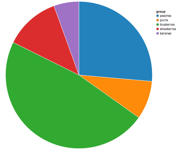
The First Visualization You Added Was A Pie Chart…
…And Followed With a Donut Chart?
Yup. I’m a troll like that. Besides, being loudly against pie charts is blowhardy (even if studies have shown that people are too stupid to evaluate them).
Adding these two charts (besides trolling) was a proof-of-concept that I understood the codebase sufficiently in order to extend the package. Now that the syntax is working for Julia v0.4, I understand how the package works (important!), and have improved the workflow by supporting Jupyter Notebook, I plan to create all of the visualizations featured in the Trifacta Vega Editor and other standard visualizations such as boxplots. If the community has requests for the order of implementation, I’ll try and accommodate them. Just add a feature request on Vega.jl GitHub issues.
Why Not Gadfly? You’re Not Starting A Language War, Are You?
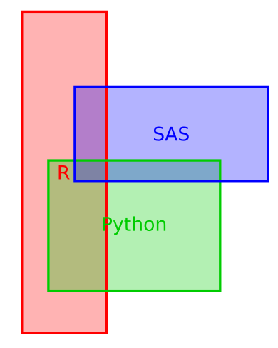
No, I’m not that big of a troll. Besides, I don’t think we’ve squeezed all the juice (blood?!) out of the R vs. Python infographic yet, we don’t need another pointless debate.
My sole reason for not improving Gadfly is just that I plain don’t understand how the codebase works! There are many amazing computer scientists & developers in the Julia community, and I’m not really one of them. I do, however, understand how to generate JSON strings and in that sense, Vega is the perfect platform for me to contribute.
Collaborators Wanted!
If you’re interested in visualization, as well as learning Julia and/or contributing to a package, Vega.jl might be a good place to start. I’m always up for collaborating with people, and creating new visualizations isn’t that difficult (especially with the Trifacta examples). So hopefully some of you will be interested in enough to join me to adding one more great visualization library to the Julia community.