Author Archives: Dean Markwick's Blog -- Julia

How to Calculate Realised Volatility

By: Dean Markwick's Blog -- Julia

Re-posted from: https://dm13450.github.io/2022/04/28/Volatility-methods.html

Volatility measures the scales of price changes and is an easy way to
describe how busy markets are. High volatility means there are periods
of large price changes and vice versa, low volatility means periods of
small changes. In this post, I’ll show you how to measure realised
volatility and demonstrate how it can be used. If you just want a live
view of crypto volatility, take a look at
cryptoliquiditymetrics where I have added in a new card with the volatility over the last 24 hours.


Enjoy these types of posts? Then you should sign up for my newsletter. It’s a short monthly recap of anything and everything I’ve found interesting recently plus
any posts I’ve written. So sign up and stay informed!


To start with we will be looking at daily data. Using my
CoinbasePro.jl package in a Julia we can get the last 300 days OHLC
prices.

I’m running Julia 1.7 and all the packages were updated using
Pkg.update() at the time of this post.

using CoinbasePro
using Dates
using Plots, StatsPlots
using DataFrames, DataFramesMeta
using RollingFunctions

From my CoinbasePro.jl
package, we can pull in the daily candles of Bitcoin. 86400 is the
frequency for daily data. Coinbase restrict you to just 300 data
points

dailydata = CoinbasePro.candles("BTC-USD", now()-Day(300), now(), 86400);
sort!(dailydata, :time)
dailydata = @transform(dailydata, :time = Date.(:time))
first(dailydata, 4)

4 rows × 7 columns

close high low open unix_time volume time
Float64 Float64 Float64 Float64 Int64 Float64 Date
1 50978.6 51459.0 48909.8 48909.8 1615075200 13965.2 2021-03-07
2 52415.2 52425.0 49328.6 50976.2 1615161600 18856.3 2021-03-08
3 54916.4 54936.0 51845.0 52413.2 1615248000 21177.1 2021-03-09
4 55890.7 57402.1 53025.0 54921.6 1615334400 28326.1 2021-03-10

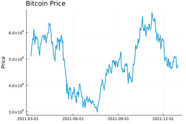
Plotting this gives you the typical price path. Now realised
volatility is a measure of how varied this price was
over time. Was it stable or were there wild swings?

plot(dailydata.time, dailydata.close, label = :none, 
     ylabel = "Price", title = "Bitcoin Price", titleloc = :left, linewidth = 2)
Bitcoin Daily Prices

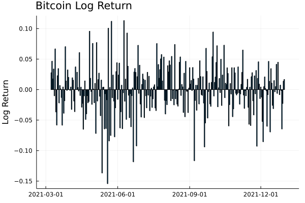
To calculate this variation, we need to add in the log-returns.

dailydata = @transform(dailydata, :returns = [NaN; diff(log.(:close))]);
bar(dailydata.time[2:end], dailydata.returns[2:end], 
    label=:none, 
    ylabel = "Log Return", title = "Bitcoin Log Return", titleloc = :left)
Bitcoin Daily Log Returns

We can start by looking at this from a distribution perspective. If we
assume the log-returns (\(r\)) are from a normal distribution, with
zero mean, the standard deviation of this distribution is the equivalent to the
volatility

\[r \sim N(0, \sigma ^2),\]

so \(\sigma\) is how we will refer to volatility. From this, you can
see how high volatility leads to wide variations in prices. Each
log-return sample has a wider range of values that it could be.

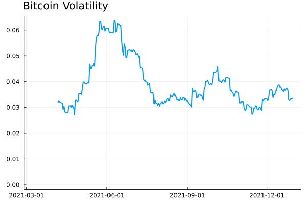
So by taking the running standard deviation of the log-returns we can
estimate the volatility and how it changes over time. Using the RollingFunctions.jl package this is a one-liner.

dailydata = @transform(dailydata, :volatility = runstd(:returns, 30))
plot(dailydata.time, dailydata.volatility, title = "Bitcoin Volatility", titleloc = :left, label=:none, linewidth = 2)
Bitcoin Daily Volatility

There was high volatility over June this year as the price of Bitcoin
crashed. It’s been fairly stable since then, hovering around 0.03
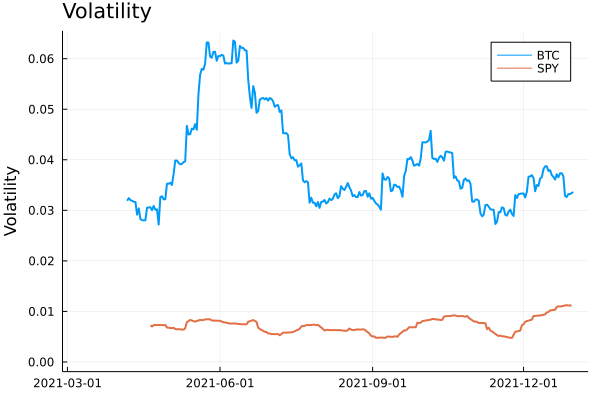
and 0.04. How does this compare though to the S&P 500 as a general
indicator of the stop market? We know Bitcoin is more volatile than
the stock market, but how much more?

I’ll load up the AlphaVantage.jl package to pull the daily prices of
the SPY ETF and repeat the calculation; adding the log-returns and
taking the rolling standard deviation.

using AlphaVantage, CSV

stockPrices = AlphaVantage.time_series_daily("SPY", datatype="csv", outputsize="full", parser = x -> CSV.File(IOBuffer(x.body))) |> DataFrame
sort!(stockPrices, :timestamp)
stockPrices = @subset(stockPrices, :timestamp .>= minimum(dailydata.time));

Again, add in the log-returns and calculate the rolling standard
deviation to estimate the volatility.

stockPrices = @transform(stockPrices, :returns = [NaN; diff(log.(:close))])
stockPrices = @transform(stockPrices, :volatility = runstd(:returns, 30));

volPlot = plot(dailydata.time, dailydata.volatility, label="BTC", 
               ylabel = "Volatility", title = "Volatility", titleloc = :left, linewidth = 2)
volPlot = plot!(volPlot, stockPrices.timestamp, stockPrices.volatility, label = "SPY", linewidth = 2)
Bitcoin and SPY volatility

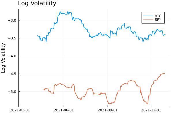
As expected, Bitcoin volatility is much higher. Let’s take the log of
the volatility to look zoom in on the detail.

volPlot = plot(dailydata.time, log.(dailydata.volatility), 
               label="BTC", ylabel = "Log Volatility", title = "Log Volatility", 
               titleloc = :left, linewidth = 2)
volPlot = plot!(volPlot, stockPrices.timestamp, log.(stockPrices.volatility), label = "SPY", linewidth = 2)
Bitcoin and SPY Log Volatility

Interestingly the SPY has had a resurgence in volatility as we move
towards the end of the year. One thing to point out though is the
slight difference in look back periods for the two products. Bitcoin
does not observe weekends or holidays, so 30 rows previously are
always 30 days, but for SPY this is the case as there are weekends and
trading holidays. In this illustrative example, it isn’t too much of an
issue, but if you were to take it further and perhaps look at the
correlation between the volatilities, this is something you would need
to account for.

A Higher Frequency Volatility

So far it has all been on daily observations, your classic dataset to
practise on. But I am always banging on about high-frequency finance,
so let’s look at more frequent data and understand how the volatility
looks at finer timescales.

This time we will pull the 5-minute candle bar data of both Bitcoin
and SPY and repeat the calculation.

  1. Calculate the log-returns of the close to close bars
  2. Calculate the rolling standard deviation by looking back 20 rows.
minuteData_spy = AlphaVantage.time_series_intraday_extended("SPY", "5min", "year1month1", parser = x -> CSV.File(IOBuffer(x.body))) |> DataFrame
minuteData_spy = @transform(minuteData_spy, :time = DateTime.(:time, dateformat"yyyy-mm-dd HH:MM:SS"))
minuteData_btc = CoinbasePro.candles("BTC-USD", maximum(minuteData_spy.time)-Day(1), maximum(minuteData_spy.time),300);

combData = leftjoin(minuteData_spy[!, [:time, :close]], minuteData_btc[!, [:time, :close]], on=[:time], makeunique=true)
rename!(combData, ["time", "spy", "btc"])
combData = combData[2:end, :]
dropmissing!(combData)
sort!(combData, :time)
first(combData, 3)

3 rows × 3 columns

time spy btc
DateTime Float64 Float64
1 2021-12-29T20:00:00 477.05 47163.9
2 2021-12-30T04:05:00 477.83 46676.3
3 2021-12-30T04:10:00 477.98 46768.8

For 5 minute data, we will use a look-back period of 20 rows, which gives us 100 minutes, so a little under 2 hours.

combData = @transform(combData, :spy_returns = [NaN; diff(log.(:spy))],
                                :btc_returns = [NaN; diff(log.(:btc))])
combData = @transform(combData, :spy_vol = runstd(:spy_returns, 20),
                                :btc_vol = runstd(:btc_returns, 20))
combData = combData[2:end, :];

Plotting it all again!

vol_tks = minimum(combData.time):Hour(6):maximum(combData.time)
vol_tkslbl = Dates.format.(vol_tks, "e HH:MM")

returnPlot = plot(combData.time[2:end], cumsum(combData.btc_returns[2:end]), 
                  label="BTC", title = "Cumulative Returns", xticks = (vol_tks, vol_tkslbl),
                  linewidth = 2, legend=:topleft)
returnPlot = plot!(returnPlot, combData.time[2:end], cumsum(combData.spy_returns[2:end]), label="SPY",
                   xticks = (vol_tks, vol_tkslbl),
                   linewidth = 2)


volPlot = plot(combData.time, combData.btc_vol * sqrt(24 * 20), 
    label="BTC", xticks = (vol_tks, vol_tkslbl), titleloc = :left, linewidth = 2)
volPlot = plot!(combData.time, combData.spy_vol * sqrt(24 * 20), label="SPY", title = "Volatility",
               xticks = (vol_tks, vol_tkslbl), titleloc = :left, linewidth = 2)

plot(returnPlot, volPlot)
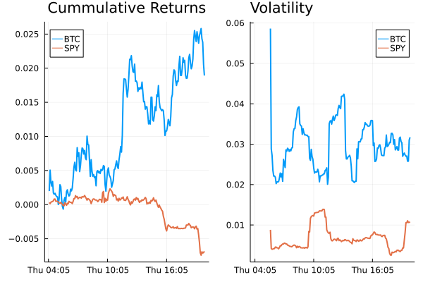
5 minute returns and volatility

On the left-hand side, we have the cumulative return of the two
assets on the 30th of December, and on the right the corresponding
volatility. Bitcoin still has higher volatility whereas SPY has been
relatively stable with just some jumps.

Simplifying the Calculation

Rolling the standard deviation isn’t the efficient way of calculating the volatility and can also be simplified down to a more efficient calculation.

The standard deviation is defined as:

\[\sigma ^2 = \mathbb{E} (r^2) + \mathbb{E} (r) ^2\]

if we assume there is no trend in the returns so that the average is zero:

\[\mathbb{E} (r) = 0\]

then we get just the first term

\[\sigma ^2 = \frac{1}{N} \sum _{i=1} ^N r^2\]

which is simply proportional to the sum of squares. Hence why you will
hear that the realised variance is referred to as the sum of squares.

Once again, let’s pull the data and repeat the previous calculations
but this time adding another column that is the rolling summation of
the square of the returns.

minutedata = CoinbasePro.candles("BTC-USD", now()-Day(1) - Hour(1), now(), 5*60)
sort!(minutedata, :time)
minutedata = @transform(minutedata, :close_close_return = [NaN; diff(log.(:close))])
minutedata = minutedata[2:end, :]
first(minutedata, 4)

minutedata = @transform(minutedata,
                                    :new_vol_5 = running(sum, :close_close_return .^2, 20),
                                    :vol_5 = runstd(:close_close_return, 20))
minutedata = minutedata[2:end, :]
minutedata[1:5, [:time, :new_vol_5, :vol_5]]

5 rows × 3 columns

time new_vol_5 vol_5
DateTime Float64 Float64
1 2021-12-30T13:40:00 3.05319e-6 0.00171371
2 2021-12-30T13:45:00 5.11203e-6 0.00139403
3 2021-12-30T13:50:00 5.11472e-6 0.00118951
4 2021-12-30T13:55:00 6.40417e-6 0.00107273
5 2021-12-30T14:00:00 6.55196e-6 0.00104028
vol_tks = minimum(minutedata.time):Hour(8):maximum(minutedata.time)
vol_tkslbl = Dates.format.(vol_tks, "e HH:MM")

ss_vol = plot(minutedata.time, sqrt.(288 * minutedata.new_vol_5), titleloc = :left, 
              title = "Sum of Squares", label=:none, xticks = (vol_tks, vol_tkslbl), linewidth = 2)
std_vol = plot(minutedata.time, sqrt.(288 * minutedata.vol_5), titleloc = :left, 
               title = "Standard Deviation", label=:none, xticks = (vol_tks, vol_tkslbl), linewidth = 2)
plot(ss_vol, std_vol)
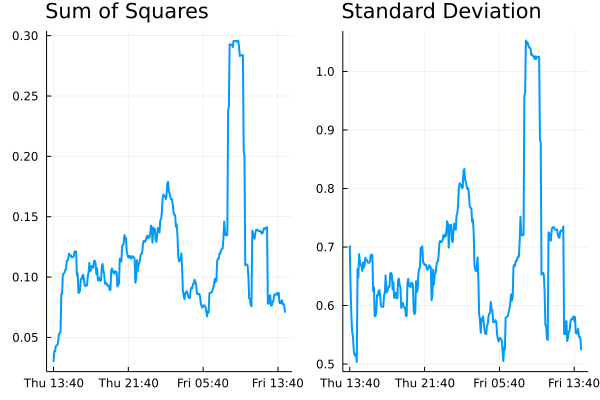
Standard deviation vs sum of squares for volatility

Both methods show represent the relative changes equally. There are
some notable edge effects in the standard deviation method, but
overall, our assumptions look fine. The y-scales are different though
as there are some constant factor differences between the two methods.

Comparing Crypto Volatilities

Let’s see how the volatility changes across some different
currencies. We define a function that calculates the close to close
return and iterate through some different currencies.

function calc_vol(ccy)
    minutedata = CoinbasePro.candles(ccy, now()-Day(1) - Hour(1), now(), 5*60)
    sort!(minutedata, :time)
    minutedata = @transform(minutedata, :close_close_return = [NaN; diff(log.(:close))])
    minutedata = minutedata[2:end, :]
    minutedata = @transform(minutedata, :var = 288*running(sum, :close_close_return .^2, 20))
    minutedata
    minutedata[21:end, :]
end

Let’s choose the classics BTC and ETH, the meme that is SHIB and
finally EURUSD (the crypto version).

p = plot(legend=:topleft, ylabel = "Realised Volatility")
for ccy in ["BTC-USD", "ETH-USD", "USDC-EUR", "SHIB-USD"]
    voldata = calc_vol(ccy)
    vol_tks = minimum(voldata.time):Hour(4):maximum(voldata.time)
    vol_tkslbl = Dates.format.(vol_tks, "e HH:MM")
    plot!(voldata.time, sqrt.(voldata.var), label = ccy, 
          xticks = (vol_tks, vol_tkslbl), linewidth = 2)
end
p
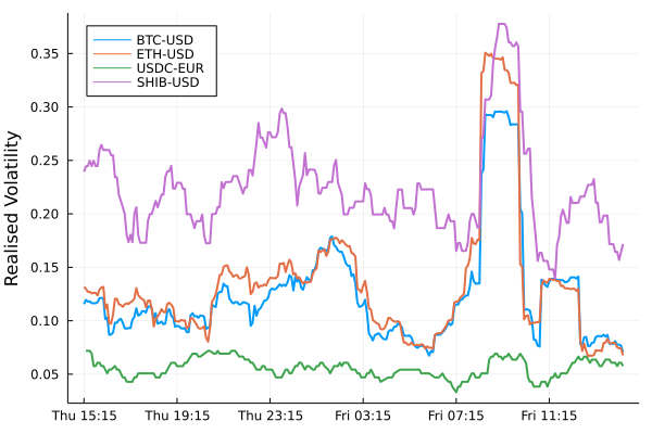
Volatility comparison between different currencies.

SHIB has higher overall volatility. ETH and BTC have very comparable
volatilities moving together. EURUSD has the lowest overall (as we
would expect), but interesting to see how it moved higher just as the
cryptos did at about 9 am.

An Update to CryptoLiquidityMetrics

So I’ve taken everything we’ve learnt here and implemented it into
cryptoliquiditymetrics.com. It is a new panel (bottom right) and
calculated all through Javascript.

Screenshot of cryptoliquiditymetrics.com

How does this help you?

Knowing the volatility helps you get an idea of how easy it is to trade
or what strategy to use. When volatility is high and the price is
moving about it might be better to be more aggressive and make sure your trade
happens. Whereas if it is a stable market without too much volatility
you could be more passive and just wait, trading slowly and picking
good prices.

Just another addition to my Javascript side project!
AlpacaMarkets.jl – Free Equity Data

By: Dean Markwick's Blog -- Julia

Re-posted from: https://dm13450.github.io/2022/03/22/AlpacaMarkets.jl-More-Free-Data.html

My quest for free and accessible data continues. This time turning to
https://alpaca.markets/. They provide both stock and crypto trades
and quotes with the ability to easily backload a database.


Enjoy these types of posts? Then sign up for my newsletter.


I’m no stranger to writing API wrappers in Julia for various data
sources, I revitalised
AlphaVantage.jl
and also behind CoinbasePro.jl, each providing a slightly different
type of data. The same is now for Alpaca Markets data. AlphaVantage
only provides candle data for stocks, whereas Alpaca gives you both
quotes and trades. This gives a new angle to look at the markets with
much more granular data. Likewise, with CoinbasePro.jl, it is good for providing real-time data, but when you try and get historical data it is limited. Alpaca removes these limits and lets you backfill as much as needed. It might take some time but gives your laptop to do something while you sleep.

Their data is from IEX (of Flash Boys fame). They provide the both the
quote and trade data free from their website
https://exchange.iex.io/products/market-data-connectivity/, so this
AlpacaMarkets.jl acts
as an easy wrapper around this data through Alpaca. Plus if Alpaca ever
add more sources you will get this without too much trouble as well.

I’ve written exact wrappers to their exposed functions, but also added some functions that will help you get the data you need without worrying about formatting timestamps or managing pagination responses.

To get started with the API you’ll need to sign up to AlpacaMarkets and get some API keys.

Getting API Credentials for Alpaca Markets

You need to sign up to Alpaca markets to obtain your developer keys to connect to their services. Once you have both the key and the secret you need to authenticate AlpacaMarkets.jl.

You can do this manually, using:

using AlpacaMarkets
AlpacaMarkets.auth(KEY, SECRET)

Where KEY and SECRET are the two values personal to you.

Or you can make sure you are always authenticated by including the keys in your startup.jl file in .julia/config/.

ENV["ALPACA_KEY"] = KEY
ENV["ALPACA_SECRET"] = SECRET

Once this is done you should all be good to go!

Free Stock Data Market

Now we are set up, we can get going with pulling some data. A few packages are needed to make our lives easier. Most importantly, AlpacaMarkets.jl.

using AlpacaMarkets
using Dates, DataFrames, DataFramesMeta
using Statistics
using Plots
using TimesDates

Stock Quote Data

A quote is a price you could buy or sell a stock for. Across the US equity landscape, there are different exchanges where you could trade a stock, so at any given time there is one place that offers the best price to buy and sell a stock.

If we look at just 1 second’s worth of quotes we get quite a bit of data back.

aapl = AlpacaMarkets.get_stock_quotes("AAPL", 
  DateTime("2022-01-27T15:00:00"),
  DateTime("2022-01-27T15:00:01"))
first(aapl, 3)

3 rows × 10 columns (omitted printing of 2 columns)

ap as ax bp bs bx c t
Float64 Int64 String Float64 Int64 String Any String
1 163.08 2 Q 163.06 1 P R 2022-01-27T15:00:00.007177Z
2 163.08 2 Q 163.05 4 Q R 2022-01-27T15:00:00.007566848Z
3 163.08 2 K 163.05 4 Q R 2022-01-27T15:00:00.010519578Z

In the ax and bx columns (ask exchange and bid exchange) we can see what venue was offering that price at a given time. More on that later.

If we want to look at this data we have to convert the timestamp into a Julia DateTime object. The values that come down the wire are a little funky, so I’ve written a help function in the AlpacaMarkets.jl module to help.

function convert_t_timestamp(x)
   ts =  first(x, 23)

    if endswith(ts, "Z")
        ts = chop(ts)
    end
    DateTime(ts)
end

function convert_t_time(x)
   ts = split(x, "T")[2]
   ts = first(ts, 12)
    if endswith(ts, "Z")
        ts = chop(ts)
    end
    Time(ts)
end

However, Julia’s default DateTime type only allows up millisecond precision. When we look at our data we have up to nanoseconds, so need to use the TimeDate.jl package to account for these extra digits.

aapl = @transform(aapl, :TimeStamp = convert_t_timestamp.(:t),
                        :TimeStamp_nano = TimeDate.(string.(chop.(:t))));

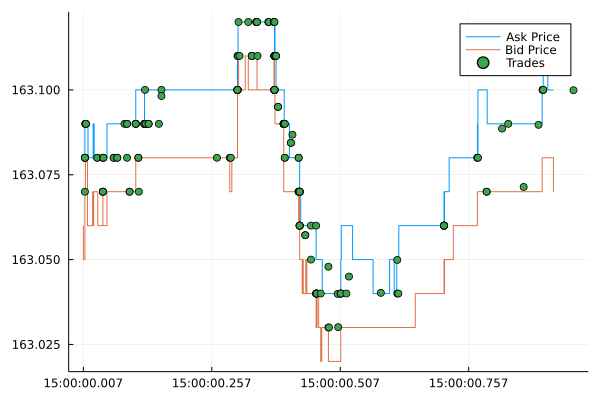
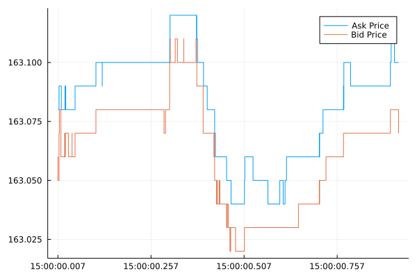
We now plot the bid and ask price.

ticks = minimum(aapl.TimeStamp):Millisecond(250):maximum(aapl.TimeStamp)
tick_labels = Dates.format.(ticks, "HH:MM:SS.sss")

plot(aapl.TimeStamp, aapl.ap, label = "Ask Price", seriestype=:steppre, xticks = (ticks, tick_labels))
plot!(aapl.TimeStamp, aapl.bp, label = "Bid Price", seriestype=:steppre)

AAPL Quoted Price

There we go, the movement of the best bid and ask price over one
second. Most data sources would condense this into a single open-high-low-close bar, whereas AlpacaMarkets.jl is giving us the raw data underneath that data. All for free!

This means you can now calculate things like:

  • Quote intensity – how often there is a new price in a set period,
  • Order flow imbalance – how the supply and demand changes in the order book,
  • Tick by tick models – predicting what the next tick will be, easier than predicting what the next price will be.

I’ve written about
Order flow imbalance
before in the crypto markets. It is about looking at frequent changes
in the best ask/offer and the amount that corresponds to these prices. Each small change gives us an idea of the supply and demand and can reasonably predict future price movements.

Overall, getting the raw best bid/offers from Alpaca across all these stocks is a treasure trove of information, and using my package you can easily save a database worth of data for your project.

Stock Trade Data

Alpaca Markets also give us access to what trades, so stock
transactions, that happened over some time. This records how much stock was traded at a given time and for what price.

Again we will look at the same one-second period.

aaplTrades  = AlpacaMarkets.get_stock_trades("AAPL", DateTime("2022-01-27T15:00:00"), DateTime("2022-01-27T15:00:01"))
first(aaplTrades, 5)

5 rows × 8 columns

c i p s t x z symbol
Any Int64 Float64 Int64 String String String String
1 @ 39300 163.07 25 2022-01-27T15:00:00.010519578Z Q C AAPL
2 I 39300 163.07 25 2022-01-27T15:00:00.010519578Z Q C AAPL
3 @ 39301 163.08 100 2022-01-27T15:00:00.010519578Z Q C AAPL
4 @ 39302 163.08 100 2022-01-27T15:00:00.010519578Z Q C AAPL
5 @ 7109 163.08 100 2022-01-27T15:00:00.010711251Z U C AAPL

We can see a new column, c which has different symbols for each row. This is the condition code and describes the type of trade. For the first two trades we see:

  • @ : Is a regular trade
  • I: is an odd lot trade

The x column dictates where the trade happened, so the venue that executed the trade. The z column tells us what tape the trade was recorded on. There are three possible tapes, A, B, and C.

Again, we convert the timestamp and plot it against the prices. We also want just the unique trade ids (i) to make sure each trade is represented once.

aaplTrades = unique(aaplTrades, :i)
aaplTrades = @transform(aaplTrades, :TimeStamp = convert_t_timestamp.(:t),
                                    :TimeStamp_nano = TimeDate.(string.(chop.(:t))));
plot(aapl.TimeStamp, aapl.ap, label = "Ask Price", seriestype=:steppre, xticks = (ticks, tick_labels))
plot!(aapl.TimeStamp, aapl.bp, label = "Bid Price", seriestype=:steppre)
plot!(aaplTrades.TimeStamp, aaplTrades.p, label="Trades", seriestype=:scatter)

AAPL Quotes and Trades

The trades line up nicely with the prices at the same time and we can see the series of trades that drove the price higher between 500 and 750 milliseconds past 15:00.

We’ve now got quite a complete picture of what happened in the second between 15:00:00 and 15:00:01.

  • 344 price updates
  • 384 trades

It’s now up to you to use that data how you see fit. Here I’ll demonstrate a few ideas.

Equity Venue Analysis

There are so many stock trading venues in the US, but what ones are good? If you’ve read Flash Boys, you might think they are all bad except for IEX. If you’ve read The Lean Startup you might think that the Long Term Stock Exchange is a good idea. But marketing and popularity aside, this is a key question for people that are fine-tuning their execution to ensure the best possible price.

But generally, we want to consider two things:

  • How long did they have the best price?
  • How much volume did they have at this best price?

So using our quote data we can try and calculate some statistics.

Let’s pull some Apple quotes over one hour now.

aaplVenue = AlpacaMarkets.get_stock_quotes("AAPL", DateTime("2022-01-27T15:00:00"), DateTime("2022-01-27T16:00:00"))
first(aaplVenue, 4)

4 rows × 10 columns (omitted printing of 2 columns)

ap as ax bp bs bx c t
Float64 Int64 String Float64 Int64 String Any String
1 163.08 2 Q 163.06 1 P R 2022-01-27T15:00:00.007177Z
2 163.08 2 Q 163.05 4 Q R 2022-01-27T15:00:00.007566848Z
3 163.08 2 K 163.05 4 Q R 2022-01-27T15:00:00.010519578Z
4 163.08 2 K 163.06 1 Q R 2022-01-27T15:00:00.010547447Z

Using the TimeDate package we can create an object with the correct resolution up to the nanosecond as reported by Alpaca Markets. We then calculate how long that price was the best bid or offer using diff.

function get_ns(x)
    getfield(x, :value)
end
    
aaplVenue = @transform(aaplVenue, :TimeStamp = convert_t_timestamp.(:t),
                                  :TimeStamp_nano = TimeDate.(string.(chop.(:t))));
aaplVenue = @transform(aaplVenue, :TimeDelta = [diff(:TimeStamp_nano); NaN])
aaplVenue = aaplVenue[1:(end-1), :]
aaplVenue = @transform(aaplVenue, :ns = get_ns.(:TimeDelta));

Now for each venue, plus bid and ask price, we group by the exchange and calculate the following:

  • How many times it was the best bid and best offer
  • The average number of shares available at this price
  • How long was the quote the best bid or offer.

This gives us three different values to assess the ‘quality’ of each venue.

gdata_bids = groupby(aaplVenue, :bx)
gdata_asks = groupby(aaplVenue, :ax)
venue_bids = @combine(gdata_bids, :n_best_bid = length(:c), 
                                  :avg_size_bid = mean(:as),
                                  :avg_time_best_bid = mean(:ns) * 1e-9)
venue_asks = @combine(gdata_asks, :n_best_ask = length(:c), 
                                  :avg_size_ask = mean(:as),
                                  :avg_time_best_ask = mean(:ns) * 1e-9)
rename!(venue_asks, ["venue", "n_best_ask", "avg_size_ask", "avg_time_best_ask"])
rename!(venue_bids, ["venue", "n_best_bid", "avg_size_bid", "avg_time_best_bid"])

venue = leftjoin(venue_bids, venue_asks, on = "venue")
venue = leftjoin(venue, rename!(AlpacaMarkets.STOCK_EXCHANGES, ["Name", "venue"]), on = "venue")

first(venue[!,["Name", "n_best_ask", "avg_size_ask", "avg_time_best_ask"]], 4)

4 rows × 4 columns

Name n_best_ask avg_size_ask avg_time_best_ask
String? Int64? Float64? Float64?
1 NYSE American (AMEX) 1536 1.83464 0.0107363
2 NASDAQ OMX BX 161 1.95652 0.0152946
3 National Stock Exchange 48 3.33333 0.00691273
4 MIAX 29431 1.26829 0.00747923

Plus all the values for the bid side too.

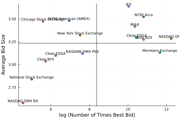
Now let’s visualise it with a quadrant plot.

plot(log.(venue.n_best_bid), venue.avg_size_bid, seriestype = :scatter, 
    label = :none, group = venue.venue, 
    series_annotations = text.(venue.Name, :bottom, pointsize=8),
    xlabel = "log (Number of Times Best Bid)",
    ylabel = "Average Bid Size")
hline!([mean(venue.avg_size_bid)], label=:none, color=:black)
vline!([mean(log.(venue.n_best_bid))], label=:none, color=:black)

Equity Venue Analysis Size and Time

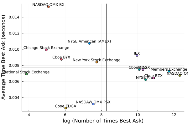
plot(log.(venue.n_best_ask), venue.avg_time_best_ask, seriestype = :scatter, 
    label = :none, group = venue.venue, 
    series_annotations = text.(venue.Name, :bottom, pointsize=8),
    xlabel = "log (Number of Times Best Ask)",
    ylabel = "Average Time Best Ask (seconds)")
hline!([mean(venue.avg_time_best_ask)], label=:none, color=:black)
vline!([mean(log.(venue.n_best_ask))], label=:none, color=:black)

Equity Venue Anlaysis Number of Times and Time

There are two clusters of exchanges and those to the right look like
the best. They are top of book the most and also quote the largest
size. To give an idea of size IEX quotes about 0.5 more shares than
the Members Exchange. For Apple with a share price of around $175,
you can trade $87.5 more notional with IEX (on average) than the
Members Exchange, so if you have a large order, it might mean going to
the market fewer times and therefore paying fewer transaction costs.

Ok so that’s something interesting with the quotes, what about the trades?

The Lee-Ready Algorithm

When Alpaca Markets sends us the trades there is no indication if the
trade was a buy or a sell. This can make analysis slightly harder as
we first have to try and guess the sign of the trade. If we look at
the plot of the trades again we can see that the trades happen
predicatably.

AAPL Trades

Most of the trades happen at the higher ask price, so they are
probably buying, and likewise, some trades fall on the bid price
line. These are probably sales.

Now guessing what sign the trades has plenty of academic research
behind it. One of the typical methods is the
Lee-Ready algorithm which
looks at where the trade is compared to the quoted mid-price at the time of the trade. If the trade is above the mid-price then it is likely that the trade was a buy and vice versa, if it was below it was likely a sell.

To evaluate this algorithm we have to join the trades with the closest prices. Normally this would just be an ASOF join, but we have to hack our way around this in Julia.

tradeTimes = aaplTrades.TimeStamp_nano
quoteTimes = aapl.TimeStamp_nano

quoteInds = searchsortedlast.([quoteTimes], tradeTimes)

aaplTrades[!, "ap"] = aapl.ap[quoteInds]
aaplTrades[!, "bp"] = aapl.bp[quoteInds]

aaplTrades = @transform(aaplTrades, :Mid = (:ap .+ :bp) ./ 2)

aaplTrades[1:4, ["t", "TimeStamp_nano", "p", "ap", "bp", "Mid"]]

4 rows × 6 columns (omitted printing of 2 columns)

t TimeStamp_nano p ap
String TimeDate Float64 Float64
1 2022-01-27T15:00:00.010519578Z 2022-01-27T15:00:00.010519578 163.07 163.08
2 2022-01-27T15:00:00.010519578Z 2022-01-27T15:00:00.010519578 163.07 163.08
3 2022-01-27T15:00:00.010519578Z 2022-01-27T15:00:00.010519578 163.08 163.08
4 2022-01-27T15:00:00.010519578Z 2022-01-27T15:00:00.010519578 163.08 163.08

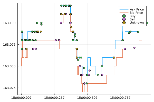
With the prices added we check the sign of the difference between the traded price and the mid-price to classify it as a buy or sell.

function classify_trade(x)
    if x == 0
        return "Unknown"
    elseif x == 1
        return "Buy"
    else
        return "Sell"
    end
end


aaplTrades = @transform(aaplTrades, :Sign = sign.(:p .- :Mid))
aaplTrades = @transform(aaplTrades, :Side = classify_trade.(:Sign))


plot(aapl.TimeStamp, aapl.ap, label = "Ask Price", seriestype=:steppre, xticks = (ticks, tick_labels))
plot!(aapl.TimeStamp, aapl.bp, label = "Bid Price", seriestype=:steppre)
plot!(aaplTrades.TimeStamp, aaplTrades.p, seriestype=:scatter, groups=aaplTrades.Side)

Lee Ready results

It’s not a 100% foolproof method, we can see that it hasn’t managed to
classify all the trades, some are unknown. It seems to struggle around
periods where the market starts moving and the mid is volatile. But there are other methods to keep digging deeper and classify all the trades.

Summary

Another angle of the free data world. Sign up to AlpacaMarkets today
and get your data to start exploring. Perhaps look at my older posts
where I’ve applied simple models to crypto data, you can change the
data to a stock and see how the results change.

Order Flow Imbalance – A High Frequency Trading Signal

By: Dean Markwick's Blog -- Julia

Re-posted from: https://dm13450.github.io/2022/02/02/Order-Flow-Imbalance.html

I’ll show you how to calculate the ‘order flow imbalance’ and build a
high-frequency trading signal with the results. We’ll see if it is a
profitable strategy and how it might be useful as a market indicator.

A couple of months ago I attended the Oxford Math Finance seminar
where there was a presentation on order book dynamics to predict
short-term price direction. Nicholas Westray presented
Deep Order Flow Imbalance: Extracting Alpha at Multiple Horizons from the Limit Order Book. By
using deep learning they predict future price movements using common
neural network architectures such as the basic multi-layer perceptron
(MLP), Long Term Short Memory network (LSTM) and convolutional neural
networks (CNN). Combining all three networks types lets you extract
the strengths of each network:

  • CNNs: Reduce frequency variations.
    • The variations between each input reduce to some common
      factors.
  • LSTMs: Learn temporal structures
    • How are the different inputs correlated with each other such as
      autocorrelation structure.
  • MPLs: Universal approximators.
    • An MLP can approximate any function.

A good reference for LSTM-CNN combinations is DeepLOB: Deep
Convolution Neural Networks for Limit Order Books

where they use this type of neural network to predict whether the
market is moving up or down.

The Deep Order Flow talk was an excellent overview of deep
learning concepts and described how there is a great overlap between
computer vision and the state of the order book. You can build an
“image” out of the different order book levels and pass this through
the neural networks. My main takeaway from the talk was the concept of
Order Flow Imbalance. This is a transformation that uses the order
book to build a feature to predict future returns.

I’ll show you how to calculate the order flow imbalance and see how
well it predicts future returns.

The Setup

I have a QuestDB database with the best bid and offer price and size
at those levels for BTCUSD from Coinbase over roughly 24 hours. To
read how I collected this data check out my previous post on
streaming data into QuestDB.

Julia easily connects to QuestDB using the LibPQ.jl package. I also
load in the basic data manipulation packages and some statistics
modules to calculate the necessary values.

using LibPQ
using DataFrames, DataFramesMeta
using Plots
using Statistics, StatsBase
using CategoricalArrays
using Dates
using RollingFunctions

conn = LibPQ.Connection("""
             dbname=qdb
             host=127.0.0.1
             password=quest
             port=8812
             user=admin""")

Order flow imbalance is about the changing state of the order book. I
need to pull out the full best bid best offer table. Each row in this
table represents when the best price or size at the best price changed.

bbo = execute(conn, 
    "SELECT *
     FROM coinbase_bbo") |> DataFrame
dropmissing!(bbo);

I add the mid-price in too, as we will need it later.

bbo = @transform(bbo, mid = (:ask .+ :bid) / 2);

It is a big dataframe, but thankfully I’ve got enough RAM.

Calculating Order Flow Imbalance

Order flow imbalance represents the changes in supply and demand. With
each row one of the price or size at the best bid or ask changes which
corresponds to change in the supply or demand, even at a high
frequency level, of Bitcoin.

  • Best bid or size at the best bid increase -> increase in demand.
  • Best bid or size at the best bid decreases -> decrease in demand.
  • Best ask decreases or size at the best ask increases -> increase
    in supply.
  • Best ask increases or size at the best ask decreases ->
    decrease in supply.

Mathematically we summarise these four effects at from time \(n-1\) to
\(n\) as:

\[e_n = I_{\{ P_n^B \geq P^B_{n-1} \}} q_n^B – I_\{ P_n^B \leq
P_{n-1}^B \} q_{n-1}^B – I_\{ P_n^A \leq P_{n-1}^A \}
q_n^A + I_\{ P_n^A \geq P_{n-1}^A \} q_{n-1}^A,\]

where \(P\) is the best price at the bid (\(P^B\)) or ask (\(P^A\)) and
\(q\) is the size at those prices.

Which might be a bit easier to read as Julia code:

e = Array{Float64}(undef, nrow(bbo))
fill!(e, 0)

for n in 2:nrow(bbo)
    
    e[n] = (bbo.bid[n] >= bbo.bid[n-1]) * bbo.bidsize[n] - 
    (bbo.bid[n] <= bbo.bid[n-1]) * bbo.bidsize[n-1] -
    (bbo.ask[n] <= bbo.ask[n-1]) * bbo.asksize[n] + 
    (bbo.ask[n] >= bbo.ask[n-1]) * bbo.asksize[n-1]
    
end

bbo[!, :e] = e;

To produce an Order Flow Imbalance (OFI) value, you need to aggregate
\(e\) over some time-bucket. As this is a high-frequency problem I’m
choosing 1 second. We also add in the open and close price of the
buckets and the return across this bucket.

bbo = @transform(bbo, timestampfloor = floor.(:timestamp, Second(1)))
bbo_g = groupby(bbo, :timestampfloor)
modeldata = @combine(bbo_g, ofi = sum(:e), OpenPrice = first(:mid), ClosePrice = last(:mid), NTicks = length(:e))
modeldata = @transform(modeldata, OpenCloseReturn = 1e4*(log.(:ClosePrice) .- log.(:OpenPrice)))
modeldata = modeldata[2:(end-1), :]
first(modeldata, 5)

5 rows × 6 columns

timestampfloor ofi OpenPrice ClosePrice NTicks OpenCloseReturn
DateTime Float64 Float64 Float64 Int64 Float64
1 2021-07-24T08:50:36 0.0753159 33655.1 33655.1 77 0.0
2 2021-07-24T08:50:37 4.44089e-16 33655.1 33655.1 47 0.0
3 2021-07-24T08:50:38 0.0 33655.1 33655.1 20 0.0
4 2021-07-24T08:50:39 3.05727 33655.1 33655.1 164 0.0
5 2021-07-24T08:50:40 2.40417 33655.1 33657.4 278 0.674467

Now we do the usual train/test split by selecting the first 70% of the
data.

trainInds = collect(1:Int(floor(nrow(modeldata)*0.7)))
trainData = modeldata[trainInds, :]
testData = modeldata[Not(trainInds), :];

We are going to fit a basic linear regression using the OFI value as
the single predictor.

using GLM

ofiModel = lm(@formula(OpenCloseReturn ~ ofi), trainData)
StatsModels.TableRegressionModel{LinearModel{GLM.LmResp{Vector{Float64}}, GLM.DensePredChol{Float64, LinearAlgebra.CholeskyPivoted{Float64, Matrix{Float64}}}}, Matrix{Float64}}

OpenCloseReturn ~ 1 + ofi

Coefficients:
─────────────────────────────────────────────────────────────────────────────
                  Coef.   Std. Error       t  Pr(>|t|)  Lower 95%   Upper 95%
─────────────────────────────────────────────────────────────────────────────
(Intercept)  -0.0181293  0.00231571    -7.83    <1e-14  -0.022668  -0.0135905
ofi           0.15439    0.000695685  221.92    <1e-99   0.153026   0.155753
─────────────────────────────────────────────────────────────────────────────

We see a positive coefficient of 0.15 which is very significant.

r2(ofiModel)
0.3972317963590547

A very high in-sample \(R^2\).

predsTrain = predict(ofiModel, trainData)
predsTest = predict(ofiModel, testData)

(mean(abs.(trainData.OpenCloseReturn .- predsTrain)),
    mean(abs.(testData.OpenCloseReturn .- predsTest)))
(0.3490577385082666, 0.35318460250890665)

Comparable mean absolute error (MAE) across both train and test sets.

sst = sum((testData.OpenCloseReturn .- mean(testData.OpenCloseReturn)) .^2)
ssr = sum((predsTest .- mean(testData.OpenCloseReturn)) .^2)
ssr/sst
0.4104873667550974

An even better \(R^2\) in the test data

extrema.([predsTest, testData.OpenCloseReturn])
2-element Vector{Tuple{Float64, Float64}}:
 (-5.400295917229609, 5.285718311926791)
 (-11.602503514716034, 11.46049286770534)

But doesn’t quite predict the largest or smallest values.

So overall:

  • Comparable R2 and MAE values across the training and test sets.
  • Positive coefficient indicates that values with high positive order flow imbalance will have a large positive return.

But, this all suffers from the cardinal sin of backtesting, we are using information from the future (the sum of the \(e\) values to form the OFI) to predict the past. By the time we know the OFI value, the close value has already happened! We need to be smarter if we want to make trading decisions based on this variable.

So whilst it doesn’t give us an actionable signal, we know that it can explain price moves, we know just have to reformulate our model and make sure there is no information leakage.

Building a Predictive Trading Signal

I now want to see if OFI can be used to predict future price
returns. First up, what do the OFI values look like and what
about if we take a rolling average?

Using the excellent RollingFunctions.jl package we can calculate
the five-minute rolling average and compare it to the raw values.

xticks = collect(minimum(trainData.timestampfloor):Hour(4):maximum(trainData.timestampfloor))
xtickslabels = Dates.format.(xticks, dateformat"HH:MM")

ofiPlot = plot(trainData.timestampfloor, trainData.ofi, label = :none, title="OFI", xticks = (xticks, xtickslabels), fmt=:png)
ofi5minPlot = plot(trainData.timestampfloor, runmean(trainData.ofi, 60*5), title="OFI: 5 Minute Average", label=:none, xticks = (xticks, xtickslabels))
plot(ofiPlot, ofi5minPlot, fmt=:png)

OFI and 5 Minute OFI

It’s very spiky, but taking the rolling average smooths it out. To
scale the OFI values to a known range, I’ll perform the Z-score
transform using the rolling five-minute window of both the mean and
variance. We will also use the close to close returns rather than the
open-close returns of the previous model and make sure it is lagged
correctly to prevent information leakage.

modeldata = @transform(modeldata, ofi_5min_avg = runmean(:ofi, 60*5),
                                  ofi_5min_var = runvar(:ofi, 60*5),
                                  CloseCloseReturn = 1e4*[diff(log.(:ClosePrice)); NaN])

modeldata = @transform(modeldata, ofi_norm = (:ofi .- :ofi_5min_avg) ./ sqrt.(:ofi_5min_var))

modeldata[!, :CloseCloseReturnLag] = [NaN; modeldata.CloseCloseReturn[1:(end-1)]]

modeldata[1:7, [:ofi, :ofi_5min_avg, :ofi_5min_var, :ofi_norm, :OpenPrice, :ClosePrice, :CloseCloseReturn]]

7 rows × 7 columns

ofi ofi_5min_avg ofi_5min_var ofi_norm OpenPrice ClosePrice CloseCloseReturn
Float64 Float64 Float64 Float64 Float64 Float64 Float64
1 0.0753159 0.0753159 0.0 NaN 33655.1 33655.1 0.0
2 4.44089e-16 0.037658 0.00283625 -0.707107 33655.1 33655.1 0.0
3 0.0 0.0251053 0.00189083 -0.57735 33655.1 33655.1 0.0
4 3.05727 0.783146 2.29977 1.49959 33655.1 33655.1 0.674467
5 2.40417 1.10735 2.25037 0.864473 33655.1 33657.4 1.97263
6 2.4536 1.33172 2.10236 0.773732 33657.4 33664.0 0.252492
7 -2.33314 0.808173 3.67071 -1.63959 33664.0 33664.9 -0.531726
xticks = collect(minimum(modeldata.timestampfloor):Hour(4):maximum(modeldata.timestampfloor))
xtickslabels = Dates.format.(xticks, dateformat"HH:MM")

plot(modeldata.timestampfloor, modeldata.ofi_norm, label = "OFI Normalised", xticks = (xticks, xtickslabels), fmt=:png)
plot!(modeldata.timestampfloor, modeldata.ofi_5min_avg, label="OFI 5 minute Average")

A plot of the normalised order flow imbalance with the rolling 5 minute average overlaid.

The OFI values have been compressed from \((-50, 50)\) to \((-10,
10)\). From the average values we can see periods of positive and
negative regimes.

When building the model we split the data into a training and
testing sample, throwing away the early values where the was not
enough values for the rolling statistics to calculate.

We use a basic linear regression with just the normalised OFI value.

trainData = modeldata[(60*5):70000, :]
testData = modeldata[70001:(end-1), :]

ofiModel_predict = lm(@formula(CloseCloseReturn ~ ofi_norm), trainData)
StatsModels.TableRegressionModel{LinearModel{GLM.LmResp{Vector{Float64}}, GLM.DensePredChol{Float64, LinearAlgebra.CholeskyPivoted{Float64, Matrix{Float64}}}}, Matrix{Float64}}

CloseCloseReturn ~ 1 + ofi_norm

Coefficients:
────────────────────────────────────────────────────────────────────────────
                 Coef.  Std. Error      t  Pr(>|t|)    Lower 95%   Upper 95%
────────────────────────────────────────────────────────────────────────────
(Intercept)  0.0020086  0.00297527   0.68    0.4996  -0.00382293  0.00784014
ofi_norm     0.144358   0.00292666  49.33    <1e-99   0.138622    0.150094
────────────────────────────────────────────────────────────────────────────

A similar value in the coefficient compared to our previous model and
it remains statistically significant.

r2(ofiModel_predict)
0.033729601695801414

Unsurprisingly, a massive reduction on in-sample \(R^2\). A value of 3%
is not that bad, in the Deep Order Flow paper they achieve values of
around 1% but over a much larger dataset and across multiple
stocks. My 24 hours of Bitcoin data is much easier to predict.

returnPredictions = predict(ofiModel_predict, testData)

testData[!, :CloseClosePred] = returnPredictions

sst = sum((testData.CloseCloseReturn .- mean(testData.CloseCloseReturn)) .^2)
ssr = sum((testData.CloseClosePred .- mean(testData.CloseCloseReturn)) .^2)
ssr/sst
0.030495583445248473

The out-of-sample \(R^2\) is also around 3%, so not that bad really in
terms of overfitting. It looks like we’ve got a potential model on our
hands.

Does This Signal Make Money?

We can now go through a very basic backtest to see if this signal is
profitable to trade. This will all be done in pure Julia, without any
other packages.

Firstly, what happens if we go long every time the model predicts a
positive return and likewise go short if the model predicts a negative
return. This means simply taking the sign of the model prediction and
multiplying it by the observed returns will give us the returns of the
strategy.

In short, this means if our model were to predict a positive return
for the next second, we would immediately buy at the close and be filled
at the closing price. We would then close out our position after the
second elapsed, again, getting filled at the next close to produce a
return.

xticks = collect(minimum(testData.timestampfloor):Hour(4):maximum(testData.timestampfloor))
xtickslabels = Dates.format.(xticks, dateformat"HH:MM")

plot(testData.timestampfloor, cumsum(sign.(testData.CloseClosePred) .* testData.CloseCloseReturn), 
    label=:none, title = "Cummulative Return", fmt=:png, xticks = (xticks, xtickslabels))

Cumulative return

Up and to the right as we would hope. So following this strategy would
make you money. Theoretically. But is it a good strategy? To measure
this we can calculate the Sharpe ratio, which is measuring the overall
profile of the returns compared to the volatility of the returns.

moneyReturns = sign.(testData.CloseClosePred) .* testData.CloseCloseReturn
mean(moneyReturns) ./ std(moneyReturns)
0.11599938576235787

A Sharpe ratio of 0.12 if we are generous and round up. Anyone with
some experience in these strategies is probably having a good chuckle
right now, this value is terrible. At the very minimum, you would
like a value of 1, i.e. that your average return is greater than the
variance in returns, otherwise you are just looking at noise.

How many times did we correctly guess the direction of the market
though? This is the hit ratio of the strategy.

mean(abs.((sign.(testData.CloseClosePred) .* sign.(testData.CloseCloseReturn))))
0.530163738236414

So 53% of the time I was correct. 3% better than a coin toss, which is
good and shows there is a little bit of information in the OFI values
when predicting.

Does a Threshold Help?

Should we be more selective when we trade? What if we set a threshold and
only trade when our prediction is greater than that value. Plus the
same in the other direction. We can iterate through lots of potential
thresholds and see where the Sharpe ratios end up.

p = plot(ylabel = "Cummulative Returns", legend=:topleft, fmt=:png)
sharpes = []
hitratio = []

for thresh in 0.01:0.01:0.99
  trades = sign.(testData.CloseClosePred) .* (abs.(testData.CloseClosePred) .> thresh)

  newMoneyReturns = trades .* testData.CloseCloseReturn

  sharpe = round(mean(newMoneyReturns) ./ std(newMoneyReturns), digits=2)
  hr = mean(abs.((sign.(trades) .* sign.(testData.CloseCloseReturn))))

  if mod(thresh, 0.2) == 0
    plot!(p, testData.timestampfloor, cumsum(newMoneyReturns), label="$(thresh)", xticks = (xticks, xtickslabels))
  end
  push!(sharpes, sharpe)
  push!(hitratio, hr)
end
p

Equity curves for different thresholds

The equity curves look worse with each higher threshold.

plot(0.01:0.01:0.99, sharpes, label=:none, title = "Sharpe vs Threshold", xlabel = "Threshold", ylabel = "Sharpe Ratio", fmt=:png)

Sharpe Ratio vs Threshold

A brief increase in Sharpe ratio if we set a small threshold, but
overall, steadily decreasing Sharpe ratios once we start trading
less. For such a simple and linear model this isn’t surprising, but
once you start chucking more variables and different modeling
approaches into the mix it can shed some light on what happens around
the different values.

Why you shouldn’t trade this model

So at the first glance, the OFI signal looks like a profitable
strategy. Now I will highlight why it isn’t in practice.

  • Trading costs will eat you alive

I’ve not taken into account any slippage, probability of fill, or
anything that a real-world trading model would need to be
practical. As our analysis around the Sharpe ratio has shown, it wants
to trade as much as possible, which means transaction costs will just
destroy the return profile. With every trade, you will pay the full
bid-ask spread in a round trip to open and then close the trade.

  • The Sharpe ratio is terrible

With a Sharpe ratio < 1 shows that there is not much actual
information in the trading pattern, it is getting lucky vs the actual
volatility in the market. Now, Sharpe ratios can get funky when we are
looking at such high-frequency data, hence why this bullet point is second to the trading costs.

  • It has been trained on a tiny amount of data.

Needless to say, given that we are looking at seconds this dataset
could be much bigger and would give us greater confidence in the
actual results once expanded to a wider time frame of multiple days.

  • I’ve probably missed something that blows this out of the water

Like everything I do, there is a strong possibility I’ve gone wrong
somewhere, forgotten a minus, ordered a time-series wrong, and various other errors.

How this model might be useful

  • An overlay for a market-making algorithm

Making markets is about posting quotes where they will get filled and
collecting the bid-ask spread. Therefore, because our model appears to
be able to predict the direction fairly ok, you could use it to place
a quote where the market will be in one second, rather than where it
is now. This helps put your quote at the top of the queue if the
market does move in that direction. Secondly, if you are traded with
and need to hedge the position, you have an idea of how long to wait
to hedge. If the market is moving in your favour, then you can wait an
extra second to hedge and benefit from the move. Likewise, if this
model is predicting a move against your inventory position, then you
know to start aggressively quoting to minimise that move against.

  • An execution algorithm

If you are potentially trading a large amount of bitcoin, then you
want to split your order up into lots of little orders. Using this
model you then know how aggressive or passive you should trade based on
where the market is predicted to move second by second. If the order
flow imbalance is trending positive, the market is going to go up, so
you want to increase your buying as not to miss out on the move and
again, if the market is predicted to move down, you’ll want to slow
down your buying so that you fully benefit from the lull.

Conclusion

Overall hopefully you now know more about order flow imbalance and how
it can somewhat explain returns. It also has some predictive power and
we use that to try and build a trading strategy around the signal.

We find that the Sharpe ratio of said strategy is poor and that
overall, using it as a trading signal on its own will not have you
retiring to the Bahamas.

This post has been another look at high-frequency finance and the
trials and tribulations around this type of data.