By: Dean Markwick's Blog -- Julia
Re-posted from: https://dm13450.github.io/2022/07/08/Machine-Learning-Property-Loans.html
Estateguru is a website that lets you lend money to property
developers. They are relatively short loans of about a year with an
interest rate of 10%. Having a high-interest rate means that the loan
is more likely to default, so you will end up receiving none of your
money. But using the data they provide from their website, can we
build a machine learning model that will help us choose loans that
won’t go bad?
I turned this blog post into a conference talk that you can watch –
Machine Learning Property Loans for Fun and Profit | Dean Markwick | JuliaCon 2023
Enjoy these types of posts? Then sign up for my newsletter.
There is a variety of information available with each loan offer. You know what country it is in, what type of property, the interest rate, and the amount of money they are asking for relative to the total property value. All of these variables will be used to set the interest rate and the higher the interest rate, the more likely the loan will go bad. Earning more interest on a loan is a consequence of the higher risk. But what if the people at Estateguru set the interest rate wrong? Can we get a better model of predicting when a loan goes bad and use that to only invest in the ‘higher’ quality loans?
I’ve done something like this before as an interview task, trying to predict when a balance sheet loan might default.
Fire up your Julia notebook and let’s get predicting!
Environment
I’m running Julia 1.7 and have the latest versions of all these packages:
using DataFrames, CSV, DataFramesMeta
using Statistics, StatsBase, CategoricalArrays
using Plots, StatsPlots
using GLM, MLDataUtils
Getting the Data
First, we need to get the actual data. On Estateguru’s statistics page (https://estateguru.co/portal/statistics/?lang=en) they have a button to download the loan book in excel format. So do that and convert it into a CSV. This makes its machine readable for Julia. When using the CSV package to pull in the data we want to normalize the names (normalizenames=true) to remove the spaces from the column headers.
rawData = CSV.read("../../../Downloads/loan_book_06_05.csv",
     DataFrame;
     normalizenames=true);
We now want to find out the good, the bad, and the ugly loans. This is contained in the status column.
@combine(groupby(rawData, "Status"), :n=length(:Status))
9 rows × 2 columns
|
Status |
n |
|
String31 |
Int64 |
| 1 |
Funded |
1171 |
| 2 |
Late |
105 |
| 3 |
Repaid |
2129 |
| 4 |
In Default |
49 |
| 5 |
Fully Recovered |
99 |
| 6 |
Partially Recovered |
44 |
| 7 |
Closed |
150 |
| 8 |
Fully Invested |
31 |
| 9 |
Open |
11 |
We are interested in the bad loans:
- Late, in default, full recovered, partially recovered
and the good loans:
The open, fully invested, closed, and funded are currently ‘live’ so we
can’t do too much about them until we are happy with the model and can
forecast the probability of default. We will use the open loans to
predict a probability of default at the very end to give us some
investment ideas.
Even though you get money back in the fully/partially recovered case,
that’s a best-case scenario, so we should be pessimistic and assume
that you don’t get anything back.
When subsetting the bad loans, I learn from my previous mistakes in making something accidentally quadratic.
goodLoans = @subset(rawData, :Status .== "Repaid")
goodLoans[:, "BadLoan"] .= 0

badLoans = rawData[findall(in(["Late", "In Default", "Full Recovered", "Partially Recovered"]),
              rawData.Status), :]
badLoans[:, "BadLoan"] .= 1

openLoans = @subset(rawData, :Status .== "Open");

modelData = vcat(goodLoans, badLoans)
mean(modelData.BadLoan)
So we have a ‘bad loan’ rate of 8.5%, and the probability of a random loan going bad is less than the average offered interest rate, so this looks like a win.
a = @combine(groupby(modelData, ["Currency", "BadLoan"]),
         :N = length(:Currency),
         :TotalNotional = sum(:Funded_Total_Amount),
         :AverageInterestRate = mean(:Interest_Rate))
a.NotionalPct = a.TotalNotional / sum(a.TotalNotional)
a
2 rows × 6 columns
|
Currency |
BadLoan |
N |
TotalNotional |
AverageInterestRate |
NotionalPct |
|
String3 |
Int64 |
Int64 |
Int64 |
Float64 |
Float64 |
| 1 |
EUR |
0 |
2129 |
285561192 |
10.6005 |
0.82557 |
| 2 |
EUR |
1 |
198 |
60334439 |
10.8977 |
0.17443 |
But in terms of notional, it’s more like a 17% default rate. So quite high in the grand scheme of things. If I had invested in every property proportional to the amount offered, I would have lost 17 cents per EUR invested! So whilst the interest rate of 10% looks high, this just shows how your losses can depend on your investing strategy.
But, if we can predict what loans might default, we can avoid them, and collect the juicy return of the good loans. Let us throw some data science at the problem and see if we can make a decent prediction. But first up, let’s explore the data.
Exploring the Estateguru Data
All good modeling starts with looking at the distribution of different variables. Starting with the quantitive ones, we want to understand the variation of interest rates, the loan relative to the property value, the property value, and the total amount asked for.
These last two are heavy-tailed so we take the logarithm of the values.
plot(
  histogram(modelData[!, "Interest_Rate"], label=:none, title = "Interest Rate"),
  histogram(modelData[!, "LTV"], label=:none, title = "LTV"),
  histogram(log.(modelData[!, "Property_Value"]), label=:none, title = "Property Value"),
  histogram(log.(modelData[!, "Funded_Total_Amount"]), label=:none, title = "Funded Total Amount")
    )
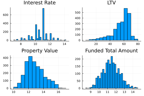
The interest rate is around 10%-11% and the average LTV is around 60%
with sensible distributions. So need to transform anything there. The
property values and funded amounts had large tails and so had to be
log-transformed to be plugged into our model.
histogram((modelData[!, "Loan_Period"]), label = :none, title = "Loan Period")
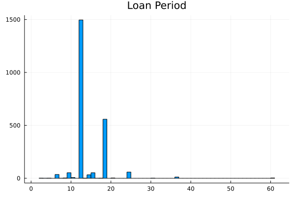
The loan period is concentrated around 12 and 18 months, so we should divide the value by 12 to convert it into years.
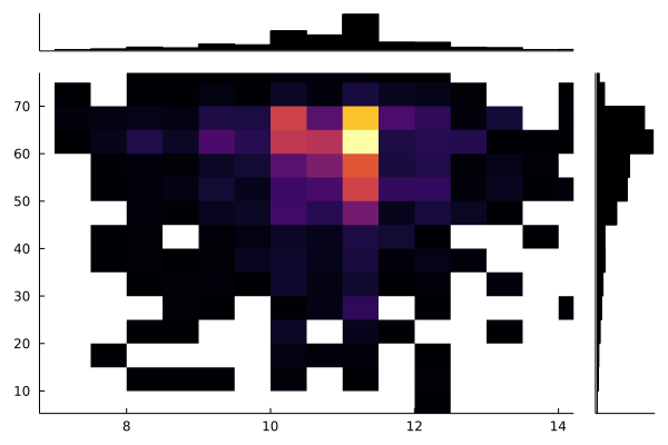
Looking at the marginal distribution of the interest rate and LTV we can see that it is mainly concentrated around those 11% return and 60% LTV properties.
@df modelData marginalhist(:Interest_Rate, :LTV)
Moving onto the qualitative variables, we want to see what factors come up the most as a proportion of the total data.
function fracPlot(data::DataFrame, column::Symbol)
    sData = @combine(groupby(data, column), :frac=length(:Currency)/nrow(data), :n=length(:Currency))
    sort!(sData, :frac, rev = true)

    bar(sData[!, column], sData[!, "frac"],   title=String(column), label = :none, orientation=:h)
end

plot(
  fracPlot(modelData, :Country),
  fracPlot(modelData, :Schedule_Type),
  fracPlot(modelData, :Suretyship_existence),
  fracPlot(modelData, :Loan_Type)
)
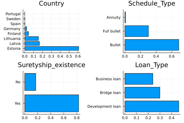
60% of all the properties are in Estonia and most have a suretyship. For those that don’t know (like me before I googled it), a suretyship is an agreement with another party to pay the loan if the original debtor can’t. So like a guarantor when you are renting your uni flat.
fracPlot(modelData, :Property_Type)
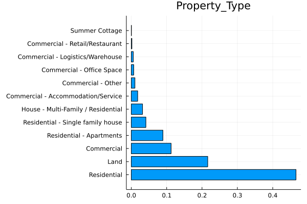
Property type looks like it contains two pieces of information, we can split on the “-“ and add another column to our data.
modelData[!, "Property_Type_A"] .= "N/A"
modelData[!, "Property_Type_B"] .= "N/A"

for i in 1:nrow(modelData)

    pt = strip.(split(modelData[i, "Property_Type"], "-"))
    modelData[i, "Property_Type_A"] = pt[1]

    if length(pt) == 1
        modelData[i, "Property_Type_B"] = pt[1]
    else
        modelData[i, "Property_Type_B"] = join(pt[2:end], " ")
    end
end
sData = @combine(groupby(modelData, ["Property_Type_A", "Property_Type_B"]),
                 :n = length(:Currency),
                 :DefaultRate = mean(:BadLoan))
|
Property_Type_A |
Property_Type_B |
n |
DefaultRate |
|
String |
String |
Int64 |
Float64 |
| 1 |
Residential |
Residential |
1084 |
0.0747232 |
| 2 |
Land |
Land |
503 |
0.0695825 |
| 3 |
Commercial |
Commercial |
262 |
0.217557 |
| 4 |
Residential |
Apartments |
208 |
0.0288462 |
| 5 |
Residential |
Single family house |
96 |
0.0 |
| 6 |
Commercial |
Accommodation/Service |
42 |
0.166667 |
| 7 |
House |
Multi Family / Residential |
74 |
0.0540541 |
| 8 |
Commercial |
Other |
24 |
0.0833333 |
| 9 |
Commercial |
Office Space |
16 |
0.0625 |
| 10 |
Commercial |
Retail/Restaurant |
4 |
0.25 |
| 11 |
Commercial |
Logistics/Warehouse |
13 |
0.307692 |
| 12 |
Summer Cottage |
Summer Cottage |
1 |
0.0 |
That Summer Cottage is annoying, I’m going to change it into residential. We potentially could do the same for the “Multi Family/ Residential” types, but as there are 74 of them, with a sensible default rate, it can be revisited later.
modelData[findall(modelData[!, "Property_Type_A"] .== "Summer Cottage"),
                  "Property_Type_A"] .= "Residential"
All of our variables should help us predict whether a loan will be repaid back or not. There is enough overlap between the qualitative features and sensible distributions in the numerical variables for us to start building our model.
Machine Learning in MLJ.jl
In R I would use the caret package
to fit a variety of machine learning models. It provides a common interface
to many different packages so you can easily iterate through different model types to see which one works best with your data. In Julia, the MLJ.jl package does the same. By setting up the data structures correctly you can fit and evaluate different types of models on your data through one interface.
In my model process, I will be using a linear model, the xgboost package, a random forest model, and a k-nearest-neighbour model. This covers all the bases, linear, and tree-based models, so should give us a reasonable model at the end of the fitting process.
To begin with, I subset my original model data frame to just the columns needed and perform the same transformations.
modelData2 = modelData[:, ["BadLoan", "Interest_Rate", "Property_Value", "Funded_Total_Amount",
                           "LTV", "Loan_Period",
                           "Country", "Schedule_Type", "Property_Type_A", "Property_Type_B",
                           "Loan_Type", "Suretyship_existence"]]

modelData2[!, "log_Funded_Total_Amount"] = log.(modelData2[!, "Funded_Total_Amount"])
modelData2[!, "log_Property_Value"] = log.(modelData2[!, "Property_Value"])
modelData2[!, "LTV"] = modelData2[!, "LTV"] /100
modelData2[!, "Loan_Period"] = modelData2[!, "Loan_Period"] /12

modelData2 = select(modelData2, Not([:Funded_Total_Amount, :Property_Value]));
MLJ requires each column to have a correctly specified type. So I need to assign each factor column the Mulitclass type.
modelData2 = coerce(modelData2,
                      :BadLoan => Multiclass,
                      :Country=>Multiclass,
                      :Schedule_Type => Multiclass,
                      :Property_Type_A => Multiclass,
                      :Property_Type_B => Multiclass,
                      :Loan_Type => Multiclass,
                      :Suretyship_existence => Multiclass);

y, X = unpack(modelData2, ==(:BadLoan); rng=123);

train, test = partition(eachindex(y), 0.7, shuffle=true); # 70:30 split
The columns now have the correct types but need to now transform the multi-class X’s into integers, which is the equivalent of one-hot-encoding. This means training a ContinuousEncoder on the data and using it to expand the multi-class columns into multiple columns.
encoder = ContinuousEncoder()
encMach = machine(encoder, X) |> fit!
X_encoded = MLJ.transform(encMach, X)
We also want to scale the 3 numeric values to be mean 0 and standard deviation 1. This is the Standardizer model and again trained, but this time only on the training rows. We don’t want to leak information into the test set.
standardizer = @load Standardizer pkg=MLJModels
stanMach = fit!(machine(standardizer(features = [:Interest_Rate, :log_Funded_Total_Amount, :log_Property_Value]),
        X_encoded); rows=train)
X_trans = MLJ.transform(stanMach, X_encoded)
By using this machine-based workflow from MLJ we can make our transformations
repeatable and ensure no leakage from the train set to the test set.
With the data all prepared, we can now move on to fitting the models.
A Null Model
Like always, we need the null model to give our baseline performance. Our
predictions need to outperform this model to make sure the models are learning something.
With MLJ you need to pull in the model from an outside package, so you
will see this as a common pattern throughout this post.
constantModel = @load ConstantClassifier pkg=MLJModels
With it loaded we create a machine (that learns) with the data and then
evaluate its performance for several different measures.
We tell the machine to only use the train rows when fitting the
model. The resulting measures are the averages across the
cross-validation folds.
constMachine = machine(constantModel(), X_trans, y)

evaluate!(constMachine,
        rows=train,
         resampling=CV(shuffle=true),
         measures=[log_loss, accuracy, kappa, brier_loss, auc],
         verbosity=0)
| Model |
Parameters |
LogLoss |
Accuracy |
Kappa |
BrierLoss |
AUC |
| Null |
– |
0.279 |
0.92 |
0.0 |
0.147 |
0.472 |
We pass through some different metrics in the evaluation phase which
gives us some indication of how the model is performing. In this case,
a $\kappa$ of zero shows that the model isn’t doing anything more than
just predicting each loan will be fine, but we have a 91%
accuracy. This is because of the class imbalance, so we want to pay
attention to the Brier loss and area under the curve (AUC) to evaluate the model.
An Interest Rate Only Model
Next up is a model that just looks at the interest rate variable as a
predictor of the default. From some underlying maths, you can prove
that the default rate of a loan is proportional to the interest rate
offered. Higher interest rate loans have a higher risk, therefore they
have a higher reward, you need to be compensated for taking on this
higher probability of defaulting. We can fit a model that uses just
the interest rate column and see if we do any better than the null
model.
The beauty of MLJ means that we can just pull in the model type and
train a new machine just like previously.
This model is just a basic logistic classifier with two parameters,
the intercept, and the interest rate. We turn off the penalisation
(lambda=0) and run the model.
logisticClassifier = @load LogisticClassifier pkg=MLJLinearModels verbosity=0

irMachine = machine(logisticClassifier(lambda = 0),  X_trans[!, ["Interest_Rate"]], y)
fit!(irMachine, rows=train, verbosity=0)
evaluate!(irMachine, rows=train,
          resampling=CV(shuffle=true), measures=[log_loss, accuracy, kappa, brier_loss, auc])
| Model |
Hyper Parameters |
LogLoss |
Accuracy |
Kappa |
BrierLoss |
AUC |
| Null |
– |
0.279 |
0.92 |
0.0 |
0.147 |
0.472 |
| Interest Rate Only |
– |
0.276 |
0.92 |
0.0 |
0.146 |
0.577 |
The AUC improves, but nothing else compared to the null model. So not
worth dwelling on really.
(classes = CategoricalValue{Int64, UInt32}[0, 1],
 coefs = [:Interest_Rate => 0.36875405640649356],
 intercept = -2.468541580016672,)
A positive value on the Interest_Rate coefficient confirms this. There
is an increase in the probability of default when the interest rate is higher.
A Linear Model
MLJ has one interface for both ridge/lasso regressive and logistic
regression. For logistic regression, we just set the penalisation value
(lambda) to 0 and train on the data but with all the features now.
lmMachine = machine(logisticClassifier(lambda=0), X_trans, y)

fit!(lmMachine, rows=train, verbosity=0)

evaluate!(lmMachine,
          rows=train,
          resampling=CV(shuffle=true),
          measures=[log_loss, accuracy, kappa, brier_loss, auc],  verbosity = 0)
| Model |
Hyper Parameters |
LogLoss |
Accuracy |
Kappa |
BrierLoss |
AUC |
| Null |
– |
0.279 |
0.92 |
0.0 |
0.147 |
0.472 |
| Interest Rate Only |
– |
0.276 |
0.92 |
0.0 |
0.146 |
0.577 |
| Logistic |
– |
0.286 |
0.928 |
0.351 |
0.112 |
0.834 |
Now we are seeing some differences. The accuracy has increased and the kappa measure is now reporting a nonzero measure. So this model has learned something about the underlying data.
Penalised Regression
Now we can start to constrain the parameters of the linear model and
see if we can improve on the basic logistic regression. The
penalty=:en enables elastic-net regression, so both a \(L_1\) and
\(L_2\) penalisation that can help prevent the model overfitting.
lmModel = logisticClassifier(penalty=:en)

gamma_range = range(lmModel, :gamma, lower = 0, upper = 0.1)
lambda_range = range(lmModel, :lambda, lower = 0, upper = 0.1)

lmTuneModel = TunedModel(model=lmModel,
                          resampling = CV(nfolds=6, shuffle=true),
                          tuning = Grid(resolution=25),
                          range = [gamma_range, lambda_range],
                          measures=[auc, log_loss, accuracy, kappa, brier_loss]);

lmTunedMachine = machine(lmTuneModel, X_trans, y);

fit!(lmTunedMachine, rows=train, verbosity=0)
We can plot the results of the tuning of the different
hyperparameters.
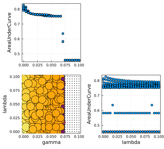
Not much performance differences over the different hyperparameters
which we can also see in the evaluation metrics, there is an actual
drop in performance. One such explanation could be the lack of overall
features compared to the number of observations, we don’t have a
massive amount of columns describing the loans.
| Model |
Hyper Parameters |
LogLoss |
Accuracy |
Kappa |
BrierLoss |
AUC |
| Null |
– |
0.279 |
0.92 |
0.0 |
0.147 |
0.472 |
| Interest Rate Only |
– |
0.276 |
0.92 |
0.0 |
0.146 |
0.577 |
| Logistic |
– |
0.286 |
0.928 |
0.351 |
0.112 |
0.834 |
| Elastic Net |
\(\gamma = 0, \lambda = 0.004\) |
0.217 |
0.923 |
0.221 |
0.119 |
0.827 |
So overall, this elastic-net model performs very little shrinkage and
doesn’t improve on the basic logistic model.
XGBoosting
We can now move on to tree-based models and the old faithful XGBoost. We will fit an untuned model and another model where we vary the hyperparameters.
xgboostModel = @load XGBoostClassifier pkg=XGBoost verbosity = 0

xgboostmodel = xgboostModel(eval_metric=:auc)

xgbMachine = machine(xgboostmodel, X_trans, y)

evaluate!(xgbMachine,
        rows=train,
         resampling=CV(nfolds = 6, shuffle=true),
         measures=[log_loss, accuracy, kappa, brier_loss, auc],
         verbosity=0)
| Model |
Hyper Parameters |
LogLoss |
Accuracy |
Kappa |
BrierLoss |
AUC |
| Null |
– |
0.279 |
0.92 |
0.0 |
0.147 |
0.472 |
| Interest Rate Only |
– |
0.276 |
0.92 |
0.0 |
0.146 |
0.577 |
| Logistic |
– |
0.286 |
0.928 |
0.351 |
0.112 |
0.834 |
| Elastic Net |
\(\gamma = 0, \lambda = 0.004\) |
0.217 |
0.923 |
0.221 |
0.119 |
0.827 |
| XGBoost |
Default |
0.206 |
0.939 |
0.514 |
0.0998 |
0.909 |
Best model so far and without any tuning! But, we can see if we can vary
some of the hyperparameters and get a better fitting model.
I’ll vary \(\gamma, \eta, \lambda\) and \(\alpha\) from 0 to 5. Have
look at the
XGBoost docs
for an overview of what the parameters mean.
gamma_range = range(xgboostmodel, :gamma, lower = 0, upper = 5)
eta_range = range(xgboostmodel, :eta, lower = 0, upper = 1)
lambda_range = range(xgboostmodel, :lambda, lower = 1, upper = 5)
alpha_range = range(xgboostmodel, :alpha, lower = 0, upper = 5)

xgbTuneModel = TunedModel(model=xgboostmodel,
                          resampling = CV(nfolds=6, shuffle = true),
                          tuning = Grid(resolution=10),
                          range = [gamma_range, eta_range, lambda_range, alpha_range],
                          measures=[log_loss, accuracy, kappa, brier_loss, auc]);

xgbTunedMachine = machine(xgbTuneModel, X_trans, y);

fit!(xgbTunedMachine, rows=train, verbosity=0)
| Model |
Hyper Parameters |
LogLoss |
Accuracy |
Kappa |
BrierLoss |
AUC |
| Null |
– |
0.279 |
0.92 |
0.0 |
0.147 |
0.472 |
| Interest Rate Only |
– |
0.276 |
0.92 |
0.0 |
0.146 |
0.577 |
| Logistic |
– |
0.286 |
0.928 |
0.351 |
0.112 |
0.834 |
| Elastic Net |
\(\gamma = 0, \lambda = 0.004\) |
0.217 |
0.923 |
0.221 |
0.119 |
0.827 |
| XGBoost |
Default |
0.206 |
0.939 |
0.514 |
0.0998 |
0.909 |
| XGBoost |
\(\alpha =0, \lambda = 4.11\) \(\gamma = 0, \eta = 0.11\) |
0.163 |
0.943 |
0.531 |
0.089 |
0.910 |
So a slight improvement in the \(\kappa\) metric, but the fact some of
the hyperparameters have gone to zero makes me think it’s going to be
overfitting the data. We will have to wait to look at the test
data performance.
K Nearest Neighbours
Next up I’ll use the K Nearest Neighbours algorithm to model the
data. This splits the data into \(K\) different chunks and attempts to
find the properties that are most similar and whether they default.
knnModel = @load KNNClassifier pkg=NearestNeighborModels verbosity = 0
knnmodel = knnModel()

knnMachine = machine(knnmodel, X_trans, y)
evaluate!(knnMachine,
        rows=train,
         resampling=CV(shuffle=true),
         measures=[log_loss, accuracy, kappa, brier_loss, auc],
         verbosity=0)
| Model |
Hyper Parameters |
LogLoss |
Accuracy |
Kappa |
BrierLoss |
AUC |
| Null |
– |
0.279 |
0.92 |
0.0 |
0.147 |
0.472 |
| Interest Rate Only |
– |
0.276 |
0.92 |
0.0 |
0.146 |
0.577 |
| Logistic |
– |
0.286 |
0.928 |
0.351 |
0.112 |
0.834 |
| Elastic Net |
\(\gamma = 0, \lambda = 0.004\) |
0.217 |
0.923 |
0.221 |
0.119 |
0.827 |
| XGBoost |
Default |
0.206 |
0.939 |
0.514 |
0.0998 |
0.909 |
| XGBoost |
\(\alpha =0, \lambda = 4.11\) \(\gamma = 0, \eta = 0.11\) |
0.163 |
0.943 |
0.531 |
0.089 |
0.910 |
| KNN |
Default |
0.81 |
0.932 |
0.377 |
0.108 |
0.839 |
Five is the default number of neighbours, but that is a
hyper-parameter that we can tune. So using the same procedure as
before, we can iterate through 5 to 100 different clusters and see
what fits best.
K_range = range(knnmodel, :K, lower=5, upper=100);

knnTunedModel = TunedModel(model=knnmodel,
                           resampling = CV(nfolds=10, shuffle=true),
                           tuning = Grid(resolution=200),
                           range = K_range,
                           measures=[auc, log_loss, accuracy, kappa, brier_loss]);

knnTunedMachine = machine(knnTunedModel, X_trans, y);
fit!(knnTunedMachine, rows=train, verbosity=0)
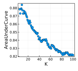
Again, when we plot the results of the tuning we see the obvious
overfitting as the number of neighbours increases.
report(knnTunedMachine).best_model
KNNClassifier(
  K = 9,
  algorithm = :kdtree,
  metric = Distances.Euclidean(0.0),
  leafsize = 10,
  reorder = true,
  weights = NearestNeighborModels.Uniform())
9 clusters appear to be the optimal amount.
| Model |
Hyper Parameters |
LogLoss |
Accuracy |
Kappa |
BrierLoss |
AUC |
| Null |
– |
0.279 |
0.92 |
0.0 |
0.147 |
0.472 |
| Interest Rate Only |
– |
0.276 |
0.92 |
0.0 |
0.146 |
0.577 |
| Logistic |
– |
0.286 |
0.928 |
0.351 |
0.112 |
0.834 |
| Elastic Net |
Tuned |
0.217 |
0.923 |
0.221 |
0.119 |
0.827 |
| XGBoost |
Default |
0.206 |
0.939 |
0.514 |
0.0998 |
0.909 |
| XGBoost |
\(\alpha =0, \lambda = 4.11\) \(\gamma = 0, \eta = 0.11\) |
0.163 |
0.943 |
0.531 |
0.089 |
0.910 |
| KNN |
Default |
0.810 |
0.932 |
0.377 |
0.108 |
0.839 |
| KNN |
\(K=9\) |
0.513 |
0.928 |
0.282 |
0.11 |
0.884 |
So no, a better log-loss and AUC measures, but the accuracy and
\(kappa\) metrics are worse.
Random Forest
Ok, final model! This is a random forest, so similar to the XGBoost
method.
randomforestModel = @load RandomForestClassifier pkg=DecisionTree verbosity = 0
randomforestmodel = randomforestModel()

rfMachine = machine(randomforestmodel, X_trans, y)
evaluate!(rfMachine,
     rows=train,
     resampling=CV(nfolds=6,shuffle=true),
     measures=[log_loss, accuracy, kappa, brier_loss, auc],
     verbosity=0)
| Model |
Hyper Parameters |
LogLoss |
Accuracy |
Kappa |
BrierLoss |
AUC |
| Null |
– |
0.279 |
0.92 |
0.0 |
0.147 |
0.472 |
| Interest Rate Only |
– |
0.276 |
0.92 |
0.0 |
0.146 |
0.577 |
| Logistic |
– |
0.286 |
0.928 |
0.351 |
0.112 |
0.834 |
| Elastic Net |
\(\gamma = 0, \lambda = 0.004\) |
0.217 |
0.923 |
0.221 |
0.119 |
0.827 |
| XGBoost |
Default |
0.206 |
0.939 |
0.514 |
0.0998 |
0.909 |
| XGBoost |
\(\alpha =0, \lambda = 4.11\) \(\gamma = 0, \eta = 0.11\) |
0.163 |
0.943 |
0.531 |
0.089 |
0.910 |
| KNN |
Default |
0.810 |
0.932 |
0.377 |
0.108 |
0.839 |
| KNN |
Tuned |
0.513 |
0.928 |
0.282 |
0.11 |
0.884 |
| Random Forest |
Default |
0.595 |
0.944 |
0.5 |
0.092 |
0.859 |
It does very well with the best \(\kappa\) aside from the XGBoost
models.
Model Stacking
Ok, I lied, one more model, but this is a combination of all the
previous results. We have 4 different candidates and rather than
choosing the single best model, we can merge them to create a
super-model that blends the prediction. This is called model stacking
and comes in useful when the different model types perform well in
different conditions.
MLJ supports model stacking straight out the box, you just have to
pass it either the default or tuned model type. I pass the random
forest, elastic-net, knn, and XGBoost model into the stacking procedure
and see what comes out.
stackModel = Stack(;metalearner=logisticClassifier(lambda = 0),
                resampling=CV(nfolds = 6, shuffle=true),
                measures=[auc],
                rf = randomforestModel(),
                lm = report(lmTunedMachine).best_model,
                knn = report(knnTunedMachine).best_model,
                xgb = report(xgbTunedMachine).best_model)

stackedMachine = machine(stackModel, X_trans, y)

fit!(stackedMachine, rows=train, verbosity=0)

evaluate!(stackedMachine;
          rows=train,
          resampling=CV(shuffle=true),
          measures=[auc, accuracy, kappa, brier_loss, auc])
| Model |
Hyper Parameters |
LogLoss |
Accuracy |
Kappa |
BrierLoss |
AUC |
| Null |
– |
0.279 |
0.92 |
0.0 |
0.147 |
0.472 |
| Interest Rate Only |
– |
0.276 |
0.92 |
0.0 |
0.146 |
0.577 |
| Logistic |
– |
0.286 |
0.928 |
0.351 |
0.112 |
0.834 |
| Elastic Net |
\(\gamma = 0, \lambda = 0.004\) |
0.217 |
0.923 |
0.221 |
0.119 |
0.827 |
| XGBoost |
Default |
0.206 |
0.939 |
0.514 |
0.0998 |
0.909 |
| XGBoost |
\(\alpha =0, \lambda = 4.11\) \(\gamma = 0, \eta = 0.11\) |
0.163 |
0.943 |
0.531 |
0.089 |
0.910 |
| KNN |
Default |
0.810 |
0.932 |
0.377 |
0.108 |
0.839 |
| KNN |
\(K=9\) |
0.513 |
0.928 |
0.282 |
0.11 |
0.884 |
| Random Forest |
Default |
0.595 |
0.944 |
0.5 |
0.092 |
0.859 |
| Stacked |
– |
0.165 |
0.944 |
0.521 |
0.088 |
0.906 |
This stacked model does not perform as well as the XGBoost model on
its own, which is a shame.
That finishes all the model fitting. Given we only have 1000
observations, any more hyperparameter tuning is going to lead to
overfitting.
When we look at the accuracy and \(\kappa\) performance XGBoost comes
out the best and gives a 2.3% uplift on the null model. In the loan
context, this means being able to avoid an extra 2 defaulting loans
out of 100. The logistic regression models struggle to compare to the nonparametric methods, even with the penalisation in the elastic-net method.
The stacked model is slightly worse than the tuned XGBoost model. As we are just combining the different models this really highlights that the different model types aren’t capturing anything too different and the XGBoost model is sufficient on its own.
All of the above metrics are based on the training data though, so we will now evaluate the test data to see what model comes out on top.
Probability Calibration
We are relying on the probability of the prediction and whether it
reflects the true underlying probability of default on the loan. It’s
not enough to just predict whether the loan will default or not, we
have to get an idea of how good our probability output is. This is
where we assess how calibrated the model outputs are. Simply put, for
all the loans that we predict to have a 10% chance of defaulting, do they default at a rate of 10%? If they do, then we can say the
model is well-calibrated.
We will evaluate the calibration of our model on the test data and see how it lines up.
To produce a calibration plot we partition our predicted probabilities
into increasing groups and then calculate the number of loans that
each defaulted in those groups. So for the 0-10% bucket, selected all
the loans that we predicted a probability in that range and then
calculate how many defaulted. A good model will have around 10% of
them defaulting.
We do this for each model and plot the results.
xgboostProb = pdf.(MLJ.predict(xgbTunedMachine, rows=test), 1)
rfProb =pdf.(MLJ.predict(rfMachine, rows=test), 1)
knnProb = pdf.(MLJ.predict(knnTunedMachine, rows=test), 1)
stackProb = pdf.(MLJ.predict(stackedMachine, rows=test), 1)
lmProb = pdf.(MLJ.predict(lmTunedMachine, rows=test), 1)
irProb = pdf.(MLJ.predict(irMachine, rows=test), 1)

probFrame = DataFrame(BadLoan = Array(y[test]),
                      XGBoost = xgboostProb, RandomForest = rfProb,
                      KNN=knnProb, Stacked=stackProb,
					  LM = lmProb, IR = irProb)

probFrame = stack(probFrame, 2:7)

rename!(probFrame, ["BadLoan", "Model", "Prob"])

#Cut the probabilities into 10% groups.
lData = @transform(probFrame, :prob = cut(:Prob, (0:0.1:1.1)))
gData = groupby(lData, ["Model", "prob"])
calibData = @combine(gData, :N = length(:BadLoan),
                            :DefaultRate = mean(:BadLoan),
                            :PredictedProb = mean(:Prob))

calibData = @transform(calibData, :Err = 1.96 .* sqrt.((:PredictedProb .* (1 .- :PredictedProb)) ./ :N))


function calib_plot(calibData, m)

    p = plot(calibData[calibData.Model .== m, :PredictedProb],
             calibData[calibData.Model .== m, :DefaultRate],
             yerr = calibData[calibData.Model .== m, :Err],
        seriestype=:scatter, title=m, legend=:none, ylim=[0,1])
    plot!(p, 0.0:0.1:1.0, 0.0:0.1:1.0, label=:none)
end

plot(
    calib_plot(calibData, "KNN"),
    calib_plot(calibData, "LM"),
    calib_plot(calibData, "XGBoost"),
    calib_plot(calibData, "Stacked"),
    calib_plot(calibData, "IR"),
    calib_plot(calibData, "RandomForest")
)
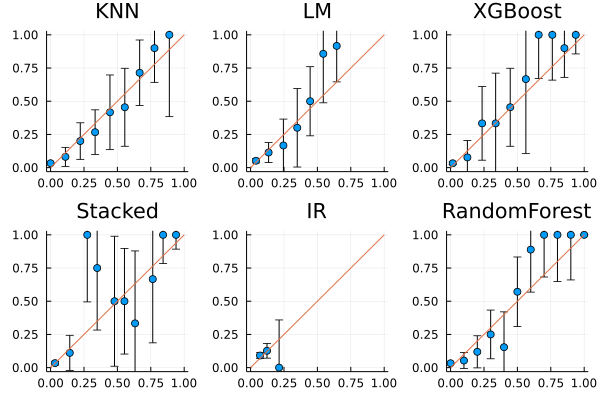
The stacked model goes a bit haywire, but overall the models and their confidence intervals line up with the perfectly calibrated red line.
We can now move on to the other metrics but this time apply them to
the test data.
modelNames = ["Null", "IR Only", "RF", "LM", "LM Tuned", "XGBoost", "XGBoost Tuned", "KNN", "KNN Tuned", "Stacked"]
modelMachines = [constMachine, irMachine, rfMachine,
               lmMachine, lmTunedMachine,
               xgbMachine, xgbTunedMachine,
               knnMachine, knnTunedMachine,
               stackedMachine]
With all the models in a list, we can map through the evaluation
metrics on the test data and see what the different models
produce. Any model that performed well on the training data but poorly
on the test data is overfitting.
aucRes = DataFrame(AUC = map(x->auc(MLJ.predict(x,rows=test), y[test]),
                modelMachines),
          Model = modelNames)
kappaRes = DataFrame(Kappa = map(x->kappa(MLJ.predict_mode(x,rows=test), y[test]), modelMachines),
          Model = modelNames)
evalRes = leftjoin(aucRes, kappaRes, on =:Model)
| Model |
Hyper Parameters |
Kappa |
AUC |
| Null |
– |
0 |
0.490 |
| Interest Rate Only |
– |
0 |
0.545 |
| Logistic |
– |
0.458 |
0.827 |
| Elastic Net |
Tuned |
0.364 |
0.797 |
| XGBoost |
Default |
0.678 |
0.849 |
| XGBoost |
Tuned |
0.655 |
0.847 |
| KNN |
Default |
0.438 |
0.816 |
| KNN |
Tuned |
0.443 |
0.820 |
| Random Forest |
Default |
0.520 |
0.820 |
| Stacked |
– |
0.3327 |
0.835 |
So on the training dataset, we can see that the default XGBoost model
performs the best, indicating that tuning the hyperparameters just
leads to overfitting. As the dataset is so small this makes sense,
there needs to be an increase in the number of loans before we can
start seeing a performance benefit in adjusting the
hyperparameters.
To get a sense of all the model performances we can use a quadrant
plot of these two models to highlight how good they are.
evalResSub = @subset(evalRes, :Kappa .> 0)

plot(evalResSub.AUC, evalResSub.Kappa, seriestype = :scatter, group=evalResSub.Model,
     legend=:none, series_annotations = text.(evalResSub.Model, :bottom, pointsize=8),
     xlabel = "AUC", ylabel = "Kappa")
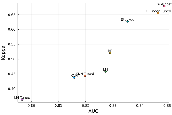
So going forward, we will use the default XGBoost model as our
probability generator.
The confusion matrix helps some up the end goal of this project. We
want to invest in good loans and avoid the bad ones. Every good
loan that we don’t invest in because our model thought it would
default is an opportunity to make money lost, and likewise, every
loan that our model thought would be good that goes bad will cost us
money.
ConfusionMatrix()(MLJ.predict_mode(xgbMachine,rows=test), y[test])
              ┌───────────────────────────┐
              │       Ground Truth        │
┌─────────────┼─────────────┬─────────────┤
│  Predicted  │      0      │      1      │
├─────────────┼─────────────┼─────────────┤
│      0      │     626     │     29      │
├─────────────┼─────────────┼─────────────┤
│      1      │      4      │     39      │
└─────────────┴─────────────┴─────────────┘
- Opportunity lost -> predicted 1 but the truth was 0.
- Money lost -> predicted 0 but the truth was 1.
So in our test set we can that the lost opportunity is quite small,
the real danger is in the money lost category, all the times our model
predicted a loan wouldn’t default but it does.
Investing in Property Loans with Our Model
Right, we’ve got a model that we think is producing sensible
results. Now the important question is whether it helps us make money.
Looking at the test set we will predict whether it will
default and use that to inform our investment decision. If the loan
doesn’t default, we earn the interest rate, if it defaults, we lose
our invested capital. Side note, this is very much like sports betting
with asymmetrical payoffs.
Let’s only invest if there is less than a 50% chance that the loan defaults.
ir = X_encoded[test, "Interest_Rate"] ./100

investFrame = DataFrame(BadLoan = Array(y[test]),
                        IR = ir,
                        PBadLoan = pdf.(MLJ.predict(xgbMachine, rows=test), 1))

investFrame = @transform(investFrame, :Invest = Int.(:PBadLoan .<= 0.5))

unitInvest = @combine(groupby(investFrame, ["Invest", "BadLoan"]),
         :N = length(:BadLoan),
         :TheoReturn = sum(  (-1 .* (:BadLoan .== 1)) + (:BadLoan .== 0) .* :IR) )
|
Invest |
BadLoan |
N |
TheoReturn |
|
Int64 |
Int64 |
Int64 |
Float64 |
| 1 |
0 |
0 |
4 |
0.43 |
| 2 |
0 |
1 |
39 |
-39.0 |
| 3 |
1 |
0 |
626 |
66.1905 |
| 4 |
1 |
1 |
29 |
-29.0 |
So there are 43 loans we chose to not invest in (4+39). 4 of those went on to pay back their loan, so an opportunity cost of 0.43. But 39 did default, so we avoided a big miss there.
We invested in 626 loans, of which 29 defaulted. But our profits on
the good loans outweighed these losses. So overall, happy days, we
ended up with more money than we started.
Our 50% threshold for investing was arbitrary, so we can vary it and see how the profit changes.
function thresh_experiment(investFrame, thresh)
    investFrame = @transform(investFrame, :Invest = Int.(:PBadLoan .<= thresh), :Thresh = thresh)

    @combine(groupby(investFrame, ["Thresh", "Invest", "BadLoan"]),
         :N = length(:BadLoan),
         :TheoReturn = sum(  (-1 .* (:BadLoan .== 1)) + (:BadLoan .== 0) .* :IR) )
end
threshRes = vcat(thresh_experiment.([investFrame], 0.05:0.05:0.95)...);
profitRes = @combine(
    groupby(
    @subset(threshRes, :Invest .== 1),
    "Thresh"
    ),
    :Profit = sum(:TheoReturn)
)

plot(profitRes.Thresh, profitRes.Profit, xlabel="Threshold Probability", ylabel="Profit", label = :none)
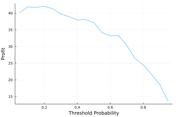
We get to improve the profitability slightly, but not in a meaningful
way, so let’s stick to our 50% rule. Why complicate things?
Kelly Betting
The Kelly bet is the optimal position sizing based on the expected
payoff and independent estimation of the probability that payoff
happens. This is perfectly suited to our situation and allows us to
invest more into loans where there is a dislocation between its
interest rate and probability of default.
From wikipedia the Kelly bet formula is:
\[f = p + \frac{p-1}{b},\]
where \(p\) is the probability the bet comes off, \(b\) is the proportion of the bet won.
In our case, the bet is place 1 unit and return \(1+r\) units. So \(b = (1+r-1)/1\) which comes our to \(r\).
So the formula is:
\[\begin{align}
f & = (1-p_\text{default}) + (1-p_\text{default} – 1)/r, \\
& = 1 – p_\text{default} – p_\text{default}/r, \\
& = 1 – p_\text{default}(1 – 1/r),
\end{align}\]
we can calculate this bet size for each loan and see how it changes our profitability.
investFrame = @transform(investFrame, :KellyBet = max.((1 .- :PBadLoan) .- (:PBadLoan./:IR), 0))
kellyInvest = @combine(groupby(investFrame, ["Invest", "BadLoan"]),
         :N = length(:BadLoan),
         :TotalStaked = sum(:KellyBet),
         :Profit = sum(  (-:KellyBet .* (:BadLoan .== 1)) + (:BadLoan .== 0) .* :KellyBet .* :IR) )
|
Invest |
BadLoan |
N |
TotalStaked |
Profit |
|
Int64 |
Int64 |
Int64 |
Float64 |
Float64 |
| 1 |
0 |
0 |
4 |
0.0 |
0.0 |
| 2 |
0 |
1 |
39 |
0.0 |
0.0 |
| 3 |
1 |
0 |
626 |
566.06 |
59.8334 |
| 4 |
1 |
1 |
29 |
21.0209 |
-21.0209 |
kellyVsUnit = @combine(investFrame,
         :N = length(:BadLoan),
         :TotalKellyStaked = sum(:KellyBet),
         :KellyProfit = sum(  (-:KellyBet .* (:BadLoan .== 1)) + (:BadLoan .== 0) .* :KellyBet .* :IR),
         :TotalUnitStaked = sum(:Invest),
         :UnitProfit = sum( :Invest .* ( (-1 .* (:BadLoan .== 1)) + (:BadLoan .== 0) .* :IR)))
@transform(kellyVsUnit, :KellyROIC = :KellyProfit ./ :TotalKellyStaked,
                        :UnitROIC = :UnitProfit ./ :TotalUnitStaked)
| Method |
Total Staked |
Total Profit |
Return |
| Unit |
655 |
37.1905 |
5.7% |
| Kelly |
587.081 |
38.8125 |
6.6% |
This shows that Kelly betting helps manage the risk of the
strategy and accounts for the uncertainty in the prediction. It has
about a 1% improvement in return versus just betting one unit each
time. It’s not the true return, as it isn’t reinvesting the profits from the
earlier paid-back loans, but it is a good indication of the
profitability of the system.
Where Will it Go Wrong?
Like all investment strategies we have to think about how we might end
up with our faces ripped off. The first one is that I cannot
understate the risk of investing in bridge loans for properties in
Europe. This is highly speculative and there is probably a reason that
the companies are coming to retail investors rather than other sources
of finance. So, there will be an element of selection bias in these
loans, they will perform well until they don’t.
Next up is the macro environment. Interest rates are currently rising
and the world is moving into a new regime. We can’t imagine that our
model will account for this so the underlying default is likely to
change over the next few months. As credit conditions tighten, it’s
likely these loans and new upcoming loans have a higher rate of
default.
Estateguru could just up and leave too. There is significant
counterparty risk in this trade as Estateguru is hardly an
established company. They recently raised money on Seedrs, so still a
very early-stage company.
Lack of sample size. This model has only 3789 rows of data of which 2327 can be used to learn about the default probability. So in reality we are very uncertain.
Currency risk. All the loans are denominated in EUR and as I get paid in GBP I’ll have to hedge out the fluctuations in currency. Can’t have the high-risk returns being eaten away by the UKs monetary policy.
Plus the most dangerous unknowns, the ones we haven’t got a clue about. We didn’t see COVID coming, who knows what else could be on the horizon.
Still, we can at least look at the current open loans and see what the model would say.
Open Loans
These are loans that we can invest in today if so inclined. So let’s estimate their probability of default.
I’ll apply all the previous transformations and predict the model
openLoans[!, "Property_Type_A"] .= "N/A"
openLoans[!, "Property_Type_B"] .= "N/A"

for i in 1:nrow(openLoans)

    pt = strip.(split(openLoans[i, "Property_Type"], "-"))
    openLoans[i, "Property_Type_A"] = pt[1]

    if length(pt) == 1
        openLoans[i, "Property_Type_B"] = pt[1]
    else
        openLoans[i, "Property_Type_B"] = join(pt[2:end], " ")
    end
end
@combine(groupby(openLoans, ["Property_Type_A", "Property_Type_B"]), :n=length(:Status))
|
Property_Type_A |
Property_Type_B |
n |
|
String |
String |
Int64 |
| 1 |
Commercial |
Commercial |
5 |
| 2 |
Residential |
Residential |
5 |
| 3 |
Land |
Land |
1 |
Not very interesting property types! At least they are all the same
category as the training set.
openData = coerce(openLoans,
                      :Country=>Multiclass,
                      :Schedule_Type => Multiclass,
                      :Property_Type_A => Multiclass,
                      :Property_Type_B => Multiclass,
                      :Loan_Type => Multiclass,
                      :Suretyship_existence => Multiclass);


openData[!, "log_Funded_Total_Amount"] = log.(openData[!, "Funded_Total_Amount"])
openData[!, "log_Property_Value"] = log.(openData[!, "Property_Value"])
openData[!, "LTV"] = openData[!, "LTV"] /100
openData[!, "Loan_Period"] = openData[!, "Loan_Period"] /12

openData = select(openData, Not([:Funded_Total_Amount, :Property_Value]));

for col in ["Country", "Schedule_Type", "Property_Type_A", "Property_Type_B",
            "Loan_Type", "Suretyship_existence"]
    levels!(openData[!, col], levels(modelData2[!, col]))
end


X_encoded_open = MLJ.transform(encMach, openData)
X_trans_open = MLJ.transform(stanMach, X_encoded_open)

pDefault = pdf.(MLJ.predict(xgbMachine, X_trans_open), 1)
openPred = DataFrame(LoanID = openLoans.Loan_code, IR = openLoans[!, "Interest_Rate"]./100,
                     PBadLoan = pDefault)
@transform(openPred, :KellyBet = max.((1 .- :PBadLoan) .- (:PBadLoan./:IR), 0))
|
LoanID |
IR |
PBadLoan |
KellyBet |
|
String15 |
Float64 |
Float32 |
Float64 |
| 1 |
EE5448 |
0.11 |
0.0108697 |
0.890315 |
| 2 |
LT5483 |
0.13 |
0.107889 |
0.0621998 |
| 3 |
EE4639-8 |
0.1 |
0.344656 |
0.0 |
| 4 |
FI8826-5 |
0.11 |
0.296051 |
0.0 |
| 5 |
EE7276-21 |
0.11 |
0.00193848 |
0.980439 |
| 6 |
ES1315-5 |
0.11 |
0.0695816 |
0.297859 |
| 7 |
DE9367-4 |
0.12 |
0.996251 |
0.0 |
| 8 |
EE6663 |
0.1075 |
0.0389999 |
0.59821 |
| 9 |
LT8958-19 |
0.13 |
0.282564 |
0.0 |
| 10 |
LT1231-5 |
0.1 |
0.332272 |
0.0 |
| 11 |
FI8738-5 |
0.12 |
0.771727 |
0.0 |
So six properties should be avoided, (the ones where the Kelly bet is
0) and the model believes all others can be invested in. So an encouraging result.
Conclusion
Given the open data, we have built a nice model exploring the
probability of default and turned it into a profitable investing
strategy. You hopefully know a bit more about MLJ.jl and how it can be
your one-stop-shop for machine learning in Julia.
Now like most things in this alt-finance space it is incredibly risky
to invest in these loans and given the way interest rates are going
it’s likely that the default rate will skyrocket. So don’t go
investing in these loans because of what I said, I’m no expert.


