By: Hendrik Ranocha -- Julia blog
Re-posted from: https://ranocha.de/blog/colors/
In this blog post, I want to share my current default choice of plotting options for articles
and presentations. After some motivation, you will find the code at the end.
When you have been in science a couple of years ago and have used MATLAB or matplotlib in Python,
you probably know the old default color map jet (or rainbow). I don’t want to reiterate the
arguments against this specific color map, since there are lots of nice ressources about it,
such as the
2007 IEEE article “Rainbow Color Map (Still) Considered Harmful” of Borland and Russel.
Today, you probably won’t use jet anymore, since it has been replaced by more sensible default
color maps in many visualization tools. If you can spare twenty minutes, I recommend watching
the talk describing the color maps in matplotlib 2
or reading matplotlib’s color map tutorial.
However, there are also other visualizations besides pseudocolor plots.
In particular, line and scatter plots are very common, e.g. for convergence studies or to show
the time evolution of a quantity of interest in a numerical simulation. And there are often several
of these quantities which shall be visualized in the same figure.
While good visualization tools vary the appearance of subsequent plots in the same figure,
just changing the color of the lines is often not sufficient, at least in my opinion. Firstly,
relying solely on colors can make the life of people affected by some sort of color blindness
really hard. Secondly, if the figure shall appear in a paper, it will probably be printed in
grayscale, since many publishers charge a lot for color figures in the printed version.
While most people will use the online
version of articles, many of them prefer to print an article to read it. And printing
something in color still costs a lot more than just printing everything in grayscale. If you
had some color figures in you PhD thesis and needed to print it several times for examination
or needed to submit it to a publisher, you will probably know what I mean. (I had only two
color pages in my PhD thesis, which is
totally okay.)
To sum up, I think it is worth investing some time in creating figures for publications.
Since I don’t want to rely exclusively on colors for accessible plots, I prefer to vary
the general shape of the plots additionally. For line plots, the lines can be solid, dotted, dashed,
dash-dotted, and there are lots of variations of the latter. To keep things simple, I prefer
to use only these four standard choices of linestyles in most figures.
For scatter plots, there are lots of markers which can be used. But I don’t want to specify
the linestyle and marker type for every plot, which can be annoying for plots
generated in a loop. Luckily, matplotlib provides a nice interface to set the style of plots.
In Python, I use
import matplotlib.pyplot as plt

# line cyclers adapted to colourblind people
from cycler import cycler
line_cycler   = (cycler(color=["#E69F00", "#56B4E9", "#009E73", "#0072B2", "#D55E00", "#CC79A7", "#F0E442"]) +
                 cycler(linestyle=["-", "--", "-.", ":", "-", "--", "-."]))
marker_cycler = (cycler(color=["#E69F00", "#56B4E9", "#009E73", "#0072B2", "#D55E00", "#CC79A7", "#F0E442"]) +
                 cycler(linestyle=["none", "none", "none", "none", "none", "none", "none"]) +
                 cycler(marker=["4", "2", "3", "1", "+", "x", "."]))
If you use only line plots via plt.plot, you can set the default cycler via
plt.rc("axes", prop_cycle=line_cycler)
If you want to choose the default cycler for each new axes, you can use
fig, ax = plt.subplots(1, 1)
ax.set_prop_cycle(line_cycler)
The corresponding Julia code is
import PyPlot; plt = PyPlot
using PyCall
using LaTeXStrings

# line cyclers adapted to colourblind people
cycler = pyimport("cycler").cycler
line_cycler   = (cycler(color=["#E69F00", "#56B4E9", "#009E73", "#0072B2", "#D55E00", "#CC79A7", "#F0E442"]) +
                 cycler(linestyle=["-", "--", "-.", ":", "-", "--", "-."]))
marker_cycler = (cycler(color=["#E69F00", "#56B4E9", "#009E73", "#0072B2", "#D55E00", "#CC79A7", "#F0E442"]) +
                 cycler(linestyle=["none", "none", "none", "none", "none", "none", "none"]) +
                 cycler(marker=["4", "2", "3", "1", "+", "x", "."]))

# matplotlib's standard cycler
standard_cycler = cycler("color", ["#1f77b4", "#ff7f0e", "#2ca02c", "#d62728", "#9467bd", "#8c564b", "#e377c2", "#7f7f7f", "#bcbd22", "#17becf"])

plt.rc("axes", prop_cycle=line_cycler)
At the time of writing, it is not possible to use different markers with plt.scatter plots,
as described in this issue on GitHub.
Nevertheless, you can get scatter plots by using the marker_cycler defined above.
I also use some additional customizations that can be found in the source files linked at the end of this blog.
More information can be found in the customizing matplotlib tutorial.
Let’s now have a look at the results. Using the line_cycler defined above, a plot looks like

The default cycler of matplotlib yields
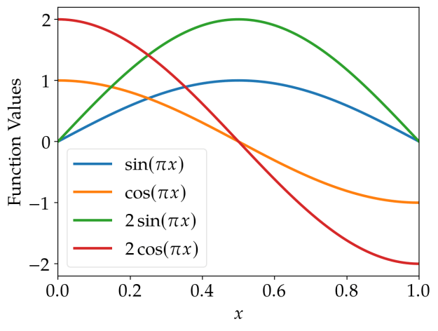
These lines are also easily distinguishable (unless you’re red blind; but even in this case, there should be
some differences of the brightness, although it is not as easy as for other people).
However, if printed in grayscale, it becomes hardly possible to identify the lines correctly using the
standard cycler of matplotlib.
 |
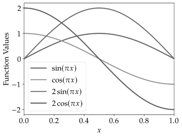 |
line_cycler |
standard_cycler |
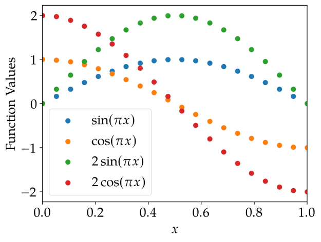
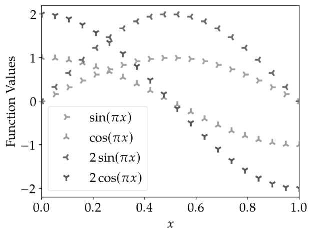
The results for scatter plots are similar: Using different marker shapes really helps to identify the plots correctly.
marker_cycler |
standard_cycler |
 |
 |
 |
 |
In my opinion, it is worth investing some time in creating accessible plots. That’s why I like to use the
color blindness simulator
to check how figures look like for people affected by some sort of color blindness and in grayscale (monochromatic view).
The Python code and
Julia code used to produce
the figures in this post contain also additional plotting options I like to use. As all code published
in this blog, these scripts are released under the terms of the MIT license.
Python Code
#!/usr/bin/python3

import matplotlib.pyplot as plt

# line cyclers adapted to colourblind people
from cycler import cycler
line_cycler   = (cycler(color=["#E69F00", "#56B4E9", "#009E73", "#0072B2", "#D55E00", "#CC79A7", "#F0E442"]) +
                 cycler(linestyle=["-", "--", "-.", ":", "-", "--", "-."]))
marker_cycler = (cycler(color=["#E69F00", "#56B4E9", "#009E73", "#0072B2", "#D55E00", "#CC79A7", "#F0E442"]) +
                 cycler(linestyle=["none", "none", "none", "none", "none", "none", "none"]) +
                 cycler(marker=["4", "2", "3", "1", "+", "x", "."]))

# matplotlib's standard cycler
standard_cycler = cycler("color", ["#1f77b4", "#ff7f0e", "#2ca02c", "#d62728", "#9467bd", "#8c564b", "#e377c2", "#7f7f7f", "#bcbd22", "#17becf"])

plt.rc("axes", prop_cycle=line_cycler)

plt.rc("text", usetex=True)
plt.rc("text.latex", preamble=r"\usepackage{newpxtext}\usepackage{newpxmath}\usepackage{commath}\usepackage{mathtools}")
plt.rc("font", family="serif", size=18.)
plt.rc("savefig", dpi=200)
plt.rc("legend", loc="best", fontsize="medium", fancybox=True, framealpha=0.5)
plt.rc("lines", linewidth=2.5, markersize=10, markeredgewidth=2.5)


import os
directory = os.path.dirname(os.path.abspath(__file__))


# plots
plt.close("all")

import numpy as np
x = np.linspace(0., 1., 200)

plt.rc("axes", prop_cycle=line_cycler)
plt.figure()
plt.plot(x,   np.sin(np.pi*x), label="$\sin(\pi x)$")
plt.plot(x,   np.cos(np.pi*x), label="$\cos(\pi x)$")
plt.plot(x, 2*np.sin(np.pi*x), label="$2 \sin(\pi x)$")
plt.plot(x, 2*np.cos(np.pi*x), label="$2 \cos(\pi x)$")
plt.legend()
plt.xlabel("$x$")
plt.xlim(x[0], x[-1])
plt.ylabel("Function Values")
plt.savefig(os.path.join(directory, "line_plot_python.png"), bbox_inches="tight")

plt.rc("axes", prop_cycle=standard_cycler)
plt.figure()
plt.plot(x,   np.sin(np.pi*x), label="$\sin(\pi x)$")
plt.plot(x,   np.cos(np.pi*x), label="$\cos(\pi x)$")
plt.plot(x, 2*np.sin(np.pi*x), label="$2 \sin(\pi x)$")
plt.plot(x, 2*np.cos(np.pi*x), label="$2 \cos(\pi x)$")
plt.legend()
plt.xlabel("$x$")
plt.xlim(x[0], x[-1])
plt.ylabel("Function Values")
plt.savefig(os.path.join(directory, "line_plot_python_standard.png"), bbox_inches="tight")


import numpy as np
x = np.linspace(0., 1., 20)

plt.rc("axes", prop_cycle=marker_cycler)
plt.figure()
plt.plot(x,   np.sin(np.pi*x), label="$\sin(\pi x)$")
plt.plot(x,   np.cos(np.pi*x), label="$\cos(\pi x)$")
plt.plot(x, 2*np.sin(np.pi*x), label="$2 \sin(\pi x)$")
plt.plot(x, 2*np.cos(np.pi*x), label="$2 \cos(\pi x)$")
plt.legend()
plt.xlabel("$x$")
plt.xlim(x[0], x[-1])
plt.ylabel("Function Values")
plt.savefig(os.path.join(directory, "marker_plot_python.png"), bbox_inches="tight")

plt.rc("axes", prop_cycle=standard_cycler)
plt.rc("lines", linewidth=1.5, markersize=6, markeredgewidth=1)
plt.figure()
plt.scatter(x,   np.sin(np.pi*x), label="$\sin(\pi x)$")
plt.scatter(x,   np.cos(np.pi*x), label="$\cos(\pi x)$")
plt.scatter(x, 2*np.sin(np.pi*x), label="$2 \sin(\pi x)$")
plt.scatter(x, 2*np.cos(np.pi*x), label="$2 \cos(\pi x)$")
plt.legend()
plt.xlabel("$x$")
plt.xlim(x[0], x[-1])
plt.ylabel("Function Values")
plt.savefig(os.path.join(directory, "marker_plot_python_standard.png"), bbox_inches="tight")
Julia Code
import PyPlot; plt = PyPlot
using PyCall
using LaTeXStrings

# line cyclers adapted to colourblind people
cycler = pyimport("cycler").cycler
line_cycler   = (cycler(color=["#E69F00", "#56B4E9", "#009E73", "#0072B2", "#D55E00", "#CC79A7", "#F0E442"]) +
                 cycler(linestyle=["-", "--", "-.", ":", "-", "--", "-."]))
marker_cycler = (cycler(color=["#E69F00", "#56B4E9", "#009E73", "#0072B2", "#D55E00", "#CC79A7", "#F0E442"]) +
                 cycler(linestyle=["none", "none", "none", "none", "none", "none", "none"]) +
                 cycler(marker=["4", "2", "3", "1", "+", "x", "."]))

# matplotlib's standard cycler
standard_cycler = cycler("color", ["#1f77b4", "#ff7f0e", "#2ca02c", "#d62728", "#9467bd", "#8c564b", "#e377c2", "#7f7f7f", "#bcbd22", "#17becf"])

plt.rc("axes", prop_cycle=line_cycler)

plt.rc("text", usetex=true)
plt.rc("text.latex", preamble="\\usepackage{newpxtext}\\usepackage{newpxmath}\\usepackage{commath}\\usepackage{mathtools}")
plt.rc("font", family="serif", size=18.)
plt.rc("savefig", dpi=200)
plt.rc("legend", loc="best", fontsize="medium", fancybox=true, framealpha=0.5)
plt.rc("lines", linewidth=2.5, markersize=10, markeredgewidth=2.5)


directory = @__DIR__


# plots
plt.close("all")

x = range(0., 1., length=200)

plt.rc("axes", prop_cycle=line_cycler)
plt.figure()
plt.plot(x,   sinpi.(x), label=L"$\sin(\pi x)$")
plt.plot(x,   cospi.(x), label=L"$\cos(\pi x)$")
plt.plot(x, 2*sinpi.(x), label=L"$2 \sin(\pi x)$")
plt.plot(x, 2*cospi.(x), label=L"$2 \cos(\pi x)$")
plt.legend()
plt.xlabel(L"$x$")
plt.xlim(x[1], x[end])
plt.ylabel("Function Values")
plt.savefig(joinpath(directory, "line_plot_julia.png"), bbox_inches="tight")

plt.rc("axes", prop_cycle=standard_cycler)
plt.figure()
plt.plot(x,   sinpi.(x), label=L"$\sin(\pi x)$")
plt.plot(x,   cospi.(x), label=L"$\cos(\pi x)$")
plt.plot(x, 2*sinpi.(x), label=L"$2 \sin(\pi x)$")
plt.plot(x, 2*cospi.(x), label=L"$2 \cos(\pi x)$")
plt.legend()
plt.xlabel(L"$x$")
plt.xlim(x[1], x[end])
plt.ylabel("Function Values")
plt.savefig(joinpath(directory, "line_plot_julia_standard.png"), bbox_inches="tight")


x = range(0., 1., length=20)

plt.rc("axes", prop_cycle=marker_cycler)
plt.figure()
plt.plot(x,   sinpi.(x), label=L"$\sin(\pi x)$")
plt.plot(x,   cospi.(x), label=L"$\cos(\pi x)$")
plt.plot(x, 2*sinpi.(x), label=L"$2 \sin(\pi x)$")
plt.plot(x, 2*cospi.(x), label=L"$2 \cos(\pi x)$")
plt.legend()
plt.xlabel(L"$x$")
plt.xlim(x[1], x[end])
plt.ylabel("Function Values")
plt.savefig(joinpath(directory, "marker_plot_julia.png"), bbox_inches="tight")

plt.rc("axes", prop_cycle=standard_cycler)
plt.rc("lines", linewidth=1.5, markersize=6, markeredgewidth=1)
plt.figure()
plt.scatter(x,   sinpi.(x), label=L"$\sin(\pi x)$")
plt.scatter(x,   cospi.(x), label=L"$\cos(\pi x)$")
plt.scatter(x, 2*sinpi.(x), label=L"$2 \sin(\pi x)$")
plt.scatter(x, 2*cospi.(x), label=L"$2 \cos(\pi x)$")
plt.legend()
plt.xlabel(L"$x$")
plt.xlim(x[1], x[end])
plt.ylabel("Function Values")
plt.savefig(joinpath(directory, "marker_plot_julia_standard.png"), bbox_inches="tight")
