Category Archives: Julia

Visualizing Graphs in Julia using Plots and PlotRecipes

By: Tom Breloff

Re-posted from: http://www.breloff.com/Graphs/

In this short post, I hope to introduce you to basic visualization of graphs (nodes connected by edges) when using Plots in Julia. The intention is that Visualizing a graph is as simple as inputting the connectivity structure, and optionally setting a ton of attributes that define the layout, labeling, colors, and more. Nodes are markers, and edges are lines. With this understanding, we can apply common Plots attributes as we see fit.


Setup

First, you’ll want to get a working setup of Plots and PlotRecipes:

# for pkg in ("Plots","PlotRecipes")
#     Pkg.add(pkg)
#     Pkg.checkout(pkg)
# end
using PlotRecipes

# we'll use the PyPlot backend, and set a couple defaults
pyplot(alpha=0.5, size=(800,400))

Type Trees

For our example, we’re going to build a graph of the type hierarchy for a Julia abstract type. We will look at the Integer abstraction, and view it at the center of all supertypes and subtypes of Integer. You can view this demo as a Jupyter notebook.

First, we’ll create a vector of our chosen type (Integer) and all its supertypes (Real, Number, and Any):

T = Integer
sups = [T]
sup = T
while sup != Any
    sup = supertype(sup)
    unshift!(sups,sup)
end

Next we will build the graph connectivity and node labels. source and destiny are lists of integers representing the indices in the edge connections of “source” to “destination”.

n = length(sups)
nodes, source, destiny = copy(sups), collect(1:n-1), collect(2:n)
function add_subs!(T, supidx)
    for sub in subtypes(T)
        push!(nodes, sub)
        subidx = length(nodes)
        push!(source, supidx)
        push!(destiny, subidx)
        add_subs!(sub, subidx)
    end
end
add_subs!(T, n)
names = map(string, nodes)

Now we will use the connectivity (source and destiny) and the node labels (names) to visualize the graphs.

graphplot

The graphplot method is a user recipe defined in PlotRecipes. It accepts many different inputs to describe the graph structure:

  • source and destiny lists, with optional weights for weighted edges
  • adjlist: a vector of int-vectors, describing the connectivity from each node
  • adjmat: an adjacency matrix
  • LightGraphs.Graph: if LightGraphs is installed

We will use the source/destiny/weights method in this post. Lets see what it looks like without overriding default settings:

graphplot(source, destiny)


Cool. Now lets add names to the nodes. Notice that the nodes take on a hexagonal shape and expand to fix the text. There are a few additional attributes you can try: fontsize, nodeshape, and nodesize.

graphplot(source, destiny, names=names)


We can also change the layout of the nodes by:

  • using one of the built-in algorithms (spectral, stress, or tree)
  • extending with NetworkLayout
  • passing an arbitrary layout function to the func keyword
  • overriding the x/y/z coordinates yourself (graphplot(..., x=x, y=y)).

As there’s a clear hierarchy to our graph, lets use the tree method:

graphplot(source, destiny, names=names, method=:tree)


The tree layout allows the additional setting of the root of the tree. Lets make the graph flow from left to right:

graphplot(source, destiny, names=names, method=:tree, root=:left)


All too easy. Finally, lets give it some color. Remember that we’re building a generic Plots visualization, where nodes are markers and edges are line segments. For more info on Plots, please read through the documentation.

weights = linspace(1,2,length(source))
graphplot(source, destiny, weights,
    names = names, method = :tree,
    l = (2, cgrad()),  # apply the default color gradient to the line (line_z values taken from edge weights)
    m = [node==T ? :orange : :steelblue for node in nodes]     # node colors
)

Summary

Visualizing graphs with PlotRecipes is pretty simple, and it’s easy to customize to your hearts content, thanks to the flexibility of Plots. In a future post, I’ll use this functionality to view and visualize neural networks using my (work in progress) efforts within JuliaML and other projects.
WatersTechnology Article on Julia in Finance and Economics

Just in time for Julia Computing’s first annual Julia Day for Finance in New York on November 30 (register here), Julia is featured in this month’s WatersTechnology, the leading FinTech (Financial Technology) magazine.

WatersTechnology reporter Anthony Malakian interviewed Julia users from across the financial sector including the Federal Reserve Bank of New York (regulator), Berkery Noyes (investment bank), BestX (foreign exchange), AOT (energy trading) and Conning (insurance).

Malakian dug in deep to understand how and why so many financial firms are turning to Julia, and examine why “Julia is poised to become one of the leading tools deployed by developers and programmers at banks, hedge funds, regulators and vendors.”

According to Stefan Karpinski, Julia Computing CTO (Finance) who leads the firm’s New York practice, “Julia is the fastest growing technology in FinTech and the up-and-coming field of RegTech (Regulatory Technology). Banks, insurers, financial firms and regulators around the world – including the New York Fed – are all using Julia for financial modeling and managing risk.”

Click here to read the full article on WatersTechnology.

Calculating lifetime cancer risk in a population

By: Karl Pettersson

Re-posted from: http://static-dust.klpn.se/posts/2016-11-06-secanc.html

Calculating lifetime cancer risk in a population

Posted on 2016-11-06

by Karl Pettersson.

Tags: epidemiology, julia

It is common to hear statements such as one in three persons will develop cancer during their lifetime, one in nine women will develop breast cancer and so on. Most often, such statements are based on a simple calculation of cumulative risk, i.e. age-specific incidence rates for a given year and cancer diagnosis are summed up to a chosen maximum age, e.g. 75 years, and the resulting cumulative incidence rate \(r\) is then converted into a probability using the formula \(1-\exp(-r)\). However, if lifetime cancer risk is interpreted as the proportion of the population which will be diagnosed with cancer during their lifetime, this method gives incorrect results, because it does not take the following into account:

  1. Future changes in cancer rates.
  2. People who die before they reach the maximum age, due to causes unrelated to cancer.
  3. People who develop cancer at ages above the maximum age.
  4. People who are diagnosed with multiple primary cancers during their lifetime.

The first problem will not be further discussed in this post, as dealing with it obviously would require projections into the future. The other problems can be assessed with a method described by Sasieni et al. (2011), which they call AMP (adjusted for multiple primaries), and which only requires routinely available data. Their idea is to build a life table where it is possible to be eliminated from the population either by being diagnosed with cancer or by dying from something other than cancer. It is then possible to calculate the proportions eliminated in these different ways. The AMP method hinges on the independence assumption that primary cancer incidence and mortality from causes other than cancer are the same among people who have had cancer as in the general population, because these groups cannot normally be differentiated in official statistics. Only the following data are required:

  1. Age-specific population size, in order to calculate incidence and mortality rates.
  2. Age-specific number of cancer cases.
  3. Age-specific number of deaths due to all causes.
  4. Age-specific number of deaths due cancer. Note that official statistics normally reports so-called underlying causes of deaths, which means that this should include complications of cancer and cancer treatment (otherwise, the independence assumption given above would be violated).

Using my LifeTable package, the AMP method can be easily implemented in Julia. I will give examples with calculations for Sweden 2014, using data from Statistics Sweden (2016) for population size, National Board of Health and Welfare (2015) for cancer cases and National Board of Health and Welfare (2016) for deaths. The data are given in 5-year age intervals from 0–4 to 80–84 years, with an open interval for ages above 85 years. The files used in the example are available via a gist. The Julia file contains the following code:

1
2
3
4
5
6
7
8
9
10
11
12
13
14
15
16
17
18
19
20
using LifeTable, DataFrames

function AmpLt(inframe, sex, rate = "inc")
	age = inframe[1]
	pop = inframe[2]
	acd = inframe[3]
	cd = inframe[4]
	cc = inframe[5]
	if rate == "inc"
		ncol = cc
		dcol = acd .- cd .+ cc
	elseif rate == "mort"
		ncol = cd
		dcol = acd
	end
	df = DataFrame(age = age, pop = pop, dcol = dcol)
	cprop = ncol ./ dcol 
	lt = PeriodLifeTable(df, sex)
	return CauseLife(lt, cprop)
end

Assuming the LifeTable package is installed and the files have been downloaded, you can calculate tables with lifetime cancer risk for Swedish females and males, at a given age:

1
2
3
4
5
include("amplt.jl")
fse14 = readtable("fse14.csv")
mse14 = readtable("mse14.csv")
ampfse14 = AmpLt(fse14, 2)
ampmse14 = AmpLt(mse14, 1)

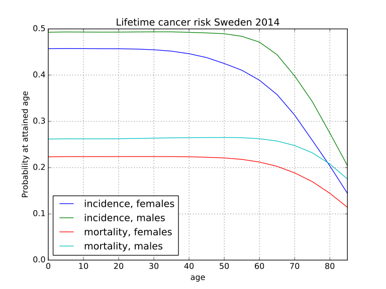
The first row in the f column in a frame returned by AmpLt gives the lifetime cancer risk at birth, which should be about 45.7 percent for females and 49.3 percent for males. It is also possible to calculate lifetime risk for cancer mortality, rather than incidence:

1
2
mampfse14 = AmpLt(fse14, 2, "mort")
mampmse14 = AmpLt(mse14, 1, "mort")

The first row in these frames should be about 22.3 and 26.2 percent for females and males. With PyPlot, the frames can be plotted:

1
2
3
4
5
6
7
8
9
plot(ampfse14[:age], ampfse14[:f], label = "incidence, females")
plot(ampfse14[:age], ampmse14[:f], label = "incidence, males")
plot(ampfse14[:age], mampfse14[:f], label = "mortality, females")
plot(ampfse14[:age], mampmse14[:f], label = "mortality, males")
title("Lifetime cancer risk Sweden 2014")
xlim(0, 85)
ylim(0, 0.5)
legend(loc=3)
grid(1)
Lifetime probabilty of cancer incidence and mortality for Swedish females and males 2014

Lifetime probabilty of cancer incidence and mortality for Swedish females and males 2014

As the chart shows, the probabilities tend to decrease with age, especially after age 60, which is due to increasing competition from other causes of death, e.g. circulatory disorders.

If cancer incidence and mortality are changed, this might also influence mortality from some non-cancer causes. For example, decreased smoking tends to decrease lung cancer incidence and mortality, as well as mortality from nonmalignant respiratory diseases and atherosclerotic diseases.1 One might ask how such risk factor changes would influence lifetime cancer risk, which might be decreased, as well as unchanged, or even increased, due to diminished competition. The following function recalculate a frame with cancer cases, as well as cancer deaths and non-cancer deaths, changed by the same factor for all age groups:

1
2
3
4
5
6
7
function RateChange(inframe, changefac)
	ncd = inframe[4] .* changefac
	ncc = inframe[5] .* changefac
	nacd = (inframe[3].-inframe[4]).*changefac .+ ncd
	return DataFrame(age = inframe[1], pop = inframe[2],
		acd = nacd, cd = ncd, cc = ncc)
end

To calculate lifetime cancer risk for Swedish females with all three rates reduced by one third, give AmpLt(RateChange(fse14, 2/3), 2). The frame returned by this call gives a lifetime risk at birth of 37.5 percent. For males, the corresponding risk is 42.6 percent. For mortality, the risks would be 19.2 and 24.0 percent for females and males respectively. If age-specific cancer incidence and mortality and non-cancer mortality are reduced by the same factor, in a society such as Sweden, which already has high life expectancy, this tends to reduce the lifetime risk of getting cancer or dying from it, because more people will survive to higher ages where the probability of getting cancer before succumbing to something else is lower (with greater reductions, the risks at lower ages asymptotically approach the corresponding risks at the highest age, i.e. 85 years in this example).

References

National Board of Health and Welfare. 2015. “Cancer.” http://www.socialstyrelsen.se/statistics/statisticaldatabase/cancer.

Sasieni, P.D., J. Shelton, N. Ormiston-Smith, C.S. Thomson and P.B. Silcocks. 2011. “What is the lifetime risk of developing cancer?: The effect of adjusting for multiple primaries.” British Journal of Cancer 105. doi:10.1038/bjc.2011.250.

Statistics Sweden. 2016. “Mean population by region, marital status, age and sex.” http://www.statistikdatabasen.scb.se/goto/en/ssd/MedelfolkHandelse.


  1. This shared risk factor can be expected to violate the independence assumption in the AMP method to some extent. However, as noted by Sasieni et al. (2011), these effects should not be serious when all cancers are studied, because there are few lung cancer survivors in the population.