By: Dean Markwick's Blog -- Julia
Re-posted from: https://dm13450.github.io/2021/11/08/AlphaVantage-Economic-Indicators.html
AlphaVantage has added endpoints to
the FRED data repository and I’ve extended the Julia package
AlphaVantage.jl to use them. This gives you an easy way to include some economic data into your models. This blog post will detail the new functions and I’ll be dusting off my AS-Level in economics to try and explain what they all mean.
What AlphaVantage has done here is nothing new, and you can get the
FRED data directly from source https://fred.stlouisfed.org both
through an API and also just downloading csvs. But having another a way to get this economic data into a Julia environment is always a bonus.
Enjoy these types of posts? Then you should sign up for my newsletter. It’s a short monthly recap of anything and everything I’ve found interesting recently plus
any posts I’ve written. So sign up and stay informed!
Make sure you’ve upgraded your AlphaVantage.jl to version to 0.4.1. I’m
running Julia 1.6.
using AlphaVantage
using Plots, DataFrames, DataFramesMeta, Dates
GDP
Gross Domestic Product (GDP) is the overall output of a country. It comprises of both goods and services, so both things that are made (goods) and things that are provided (services). You can think of it as countries overall revenue and summarise how well a country is doing. Good if it is increasing, bad if it is decreasing.
AlphaVantage gives the ability to pull both quarterly and annual values.
realgdp = AlphaVantage.real_gdp("annual") |> DataFrame
realgdp[!, :timestamp] = Date.(realgdp[!, :timestamp])

quartgdp = AlphaVantage.real_gdp("quarterly") |> DataFrame
quartgdp[!, :timestamp] = Date.(quartgdp[!, :timestamp]);
a_tks = minimum(realgdp.timestamp):Year(15):maximum(realgdp.timestamp)
a_tkslbl = Dates.format.(a_tks, "yyyy")

q_tks = minimum(quartgdp.timestamp):Year(4):maximum(quartgdp.timestamp)
q_tkslbl = Dates.format.(q_tks, "yyyy")

aGDP = plot(realgdp[!, :timestamp], realgdp[!, :value], label=:none, title="Annual GDP", xticks = (a_tks, a_tkslbl))
qGDP = plot(quartgdp[!, :timestamp], quartgdp[!, :value], label = :none, title = "Quarterly GDP", xticks = (q_tks, q_tkslbl))

plot(aGDP, qGDP)
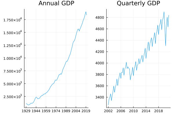
There are very few periods where GDP has decreased, although it has
recently been because of COVID. The effects of COVID will crop up
quite a bit in this post.
Real GDP per Capita
The problem with GDP is that it doesn’t take into account how big the country is. If you have more people in your economy then you can probably generate more money. Likewise, to compare your current GDP with historical values it is probably wise to divide by the population size, which gives a general indication of overal quality of life.
gdpPerCapita = AlphaVantage.real_gdp_per_capita() |> DataFrame
gdpPerCapita[!, :timestamp] = Date.(gdpPerCapita[!, :timestamp])

plot(gdpPerCapita.timestamp, gdpPerCapita.value, label=:none)
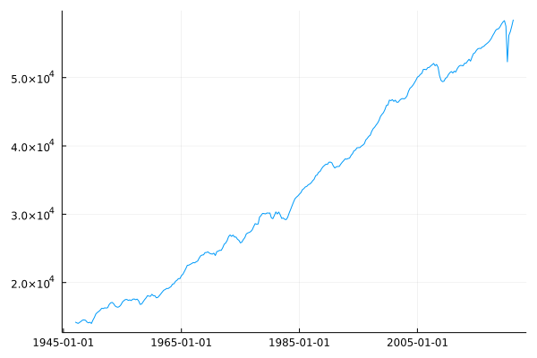
Again, another drop because of COVID but getting close to reverting on trend
Treasury Yield
The treasury yield represents what percentage return you get for lending money to the US government. As the US government is continuously issuing new debt you could choose lots of different lengths of times to lend the money, the longer you lend money for, the higher your rate of return because you are taking on more risk. FRED provides four different tenors (lengths of time) and what the average yield on your money would be if you bought on that day.
yields = AlphaVantage.treasury_yield.("daily", ["3month", "5year", "10year", "30year"]);
We take advantage of broadcasting to pull the data of each tenor before joining all the data into one big dataframe.
yields = DataFrame.(yields)

tenor = [3, 5*12, 10*12, 30*12]

allyields = mapreduce(i -> begin
        yields[i][!, :Tenor] .= tenor[i]
        yields[i][!, :timestamp] = Date.(yields[i][!, :timestamp])
        return yields[i]
        end, vcat, 1:4)

allyields = @subset(allyields, :value .!= ".")
allyields[!, :value] = convert.(Float64, allyields[!, :value]);
plot(allyields[!, :timestamp], allyields[!, :value], group = allyields[!, :Tenor], ylabel = "Yield (%)")
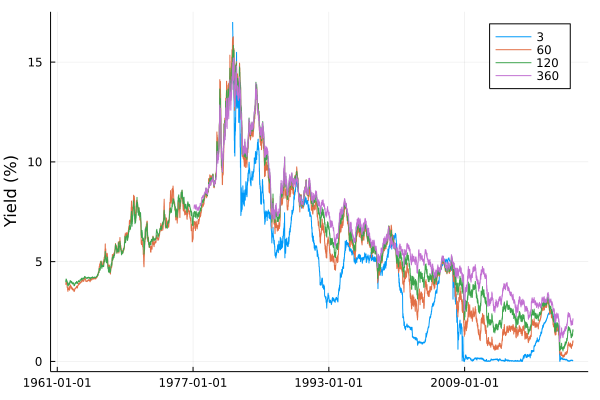
Rates have continuously fallen since the peaks in the 1980s. You can also
What happens though when the short-term yields are higher than the
long-term rates? This is when the yield curve ‘inverts’ and the market
believes the short-term risk is higher than the long-term risk. It is very rare, as we can see above, the blue line has only crossed the highest a few times. When was the last time? It was over the great financial crisis. On the 26th of Feb 2007, this happened with the 3-month rate crossing 5% whilst the 30 year was still less than 5%. The very next day there was a market crash and the stock market has one of the largest falls in history.
creditcrunch = @subset(allyields, in.(:timestamp, [[Date("2007-02-26"),
                                                    Date("2008-02-26"),
                                                    Date("2009-02-26"),
                                                    Date("2010-02-26")]]))

plot(creditcrunch.Tenor,
    creditcrunch.value,
    group = creditcrunch.timestamp, marker = :d,
    legendposition = :bottomright,
     title = "Yield Curve", xlabel="Tenor (days)", legend=:bottomright, ylabel = "Yield (%)")
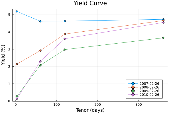
This is the yield curve throughout the years on that same day. We can see that usually, it is increasing, but on the day before the market crash it flipped and there was little difference in the other rates. So next time you hear about the yield curve inverting, you can join everyone else in getting nervous.
Federal Fund Rate
This is what is decided by the FOMC on Thursday afternoons.
The rate at which lending institutions lend overnight and is
uncollateralised, which means that don’t have to put down any type of
collateral for the loan. Gives an indication of the overall interest
rate in the American economy. Our (the UK) equivalent is the Bank of England rate, or in Europe the ECB right. This is essentially what you could put as \(r\), the risk-free rate in the Black Scholes model.
fedFundRate = AlphaVantage.federal_fund_rate("monthly") |> DataFrame

fedFundRate[!, :timestamp] = Date.(fedFundRate[!, :timestamp])
fedFundRate[!, :value] = convert.(Float64, fedFundRate[!, :value])

plot(fedFundRate.timestamp, fedFundRate.value, label=:none, title="Federal Fund Rate")
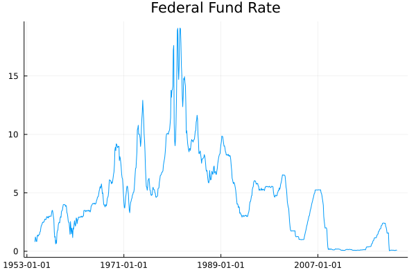
Again, much like the treasury rates, it has fallen steadily since the 1980s. You might be wondering what the difference is between this rate and the above treasury interest rates. This Federal Fund Rate is set by the FOMC and represents bank to bank lending, whereas anyone can buy a treasury and receive that return. Essentially, the Federal Fund Rate is the overall driver of the treasuries.
So, why would the FOMC change the Federal Fund Rate? One of the reasons would be down to inflation and how prices are changing for the average person.
Consumer Price Index (CPI)
This is the consumer price index and represents the price of goods in a basket and how it has changed over time. This provides some measure of inflation and tells us how prices have changed.
AlphaVantage provides this both on a monthly and a semiannual basis.
cpi = AlphaVantage.cpi("monthly") |> DataFrame

cpi[!, :timestamp] = Date.(cpi[!, :timestamp])
cpi[!, :value] = convert.(Float64, cpi[!, :value])

plot(cpi.timestamp, cpi.value, title = "CPI", label = :none)
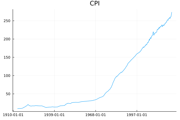
Prices have been consistently increasing which indicates inflation, but quoting the CPI value isn’t all that intuitive. Instead, what we need is the change in prices to truly reflect how prices have increased, or decreased.
Inflation and Inflation Expectation
Inflation is the compliment to the above CPI measure and provides a percentage to understand how prices have changed over some time.
Inflation is also funny as people will change their behaviour based on
what they think inflation is, rather than what it actually might
be. This is where the inflation expectation comes in handy. If there
is an expectation of high future inflation people might save more to
prepare for higher prices, or they might spend more now to get in front of higher prices. Likewise, if a bank is trying to price a mortgage, higher inflation in the future would reduce the value of the future repayments, so they would adjust the interest rate accordingly.
AlphaVantage provides both from the FRED Datasource inflation (yearly) and inflation_expectation (monthly).
inflation = AlphaVantage.inflation() |> DataFrame
expInflation = AlphaVantage.inflation_expectation() |> DataFrame

inflation[!, :Label] .= "Actual"
expInflation[!, :Label] .= "Expectation"
inflation = vcat(inflation, expInflation)

inflation[!, :timestamp] = Date.(inflation[!, :timestamp])
inflation[!, :value] = convert.(Float64, inflation[!, :value])

plot(inflation.timestamp, inflation.value, group=inflation.Label, title="Inflation")
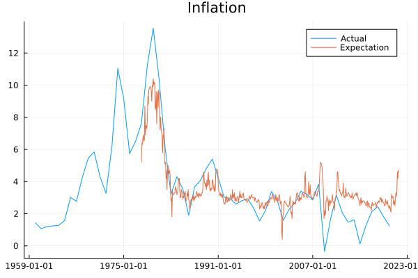
Since the GFC inflation expectation has been consistently higher than the actual value of inflation. Expectations have also seen a large increase recently. Inflation is becoming an increasing concern in this current economy.
Consumer Sentiment
Consumer sentiment comes from a survey of around 500 people in
America. They are asked how they feel about the economy and their general outlook on what is happening. This is then condensed down into a number which we can view as an indicator of how people feel. Again, like the inflation expectation, it can sometimes be more important to focus on people’s thoughts vs everyone’s actions. Take the petrol crisis here in the UK, I imagine everyone believes they are not the ones panic buying, however, if no-one was panic buying, there would still be petrol! Likewise, if everyone is talking negatively about the economy but not changing behaviour, then it could still have a negative overall effect.
sentiment = AlphaVantage.consumer_sentiment() |> DataFrame

sentiment = @subset(sentiment, :value .!= ".")
sentiment.timestamp = Date.(sentiment.timestamp)

plot(sentiment.timestamp, sentiment.value, label=:none, title="Consumer Sentiment")
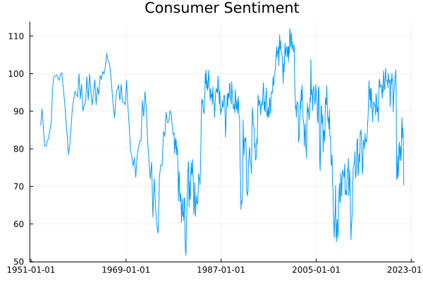
Consumer sentiment has been consistent throughout the years, with overall sentiment peaking in the 2000s and at its worse in the 1980s. Understandably, COVID had a major effect causing a fall that had been recovering but has since reversed I imagine based on inflation fears.
Retail Sales and Durable Goods
Retail sales and durable goods are all about what is being bought in the economy. Retail sales consist of things like eating at restaurants, buying clothes, and similar goods. Think of it as doing your weekly shop and how that can vary week on week. Sometimes you might be stocking up on cleaning products, other times you might be buying more food. All of those will be counted in the retail sales survey.
Whereas durable goods are your big-ticket purchases, things that you use more than once and have sort of further use. Cars, ovens, and refrigerators are good examples. Something you’ll save up for and buy at a special store rather than at Tesco.
So these two measures can give a good idea of how people are acting in the economy, are the weekly shops decreasing at the same time as the durable sales because people are spending less across the board? Or is there a sudden increase in durable goods as retail sales remain constant because people suddenly have access to more money to buy a car etc. All sorts of ways you can interpret the numbers.
retails = AlphaVantage.retail_sales() |> DataFrame
goods = AlphaVantage.durables() |> DataFrame;
retails[!, :Label] .= "Retail Sales"
goods[!, :Label] .= "Durable Goods"
retails = vcat(retails, goods)
retails.timestamp = Date.(retails.timestamp)

plot(retails.timestamp, retails.value, group=retails.Label, legend=:topleft)
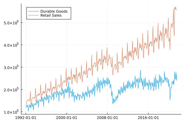
We can see that they are very seasonal, with large variations
throughout the year. Durable goods took a hit over the COVID crisis,
whereas retail sales have continued to increase and regained their highs even after a COVID decrease.
Unemployment and Non-Farm Payrolls
Finally, we have the unemployment figures. This includes the explicit unemployment rate, expressed as a percentage and also the Non-Farm Payrolls (NFP) number. This is the opposite of an unemployment rate and indicates the current number of people employed. Both of these numbers are monthly figures.
unemployment = AlphaVantage.unemployment() |> DataFrame
nfp = AlphaVantage.nonfarm_payroll() |> DataFrame

unemployment[!, :label] .= "Unemployment"
nfp[!, :label] .= "NFP"

nfp.timestamp = Date.(nfp.timestamp)
unemployment.timestamp = Date.(unemployment.timestamp)

utks = minimum(unemployment.timestamp):Year(12):maximum(unemployment.timestamp)
utkslabel = Dates.format.(utks, "yyyy")

ntks = minimum(nfp.timestamp):Year(13):maximum(nfp.timestamp)
ntkslabel = Dates.format.(ntks, "yyyy")

unemPlot = plot(unemployment.timestamp, unemployment.value, title = "Unemployment", label=:none, xticks = (utks, utkslabel))
nfpPlot = plot(nfp.timestamp, nfp.value, title = "NFP", label=:none, xticks = (ntks , ntkslabel))

plot(unemPlot, nfpPlot)
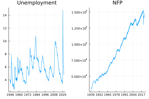
Unemployment went very high briefly after COVID before coming back down, so seems to have adverted that crisis. NFP numbers are also progressing upwards since the COVID disruption.
Conclusion
Well done on making it this far. Quite a few words and also graphs that all appear to look very similar. Hopefully, you’ve learned something new, or you are about to correct me on something by leaving a comment below!